Artist Overview
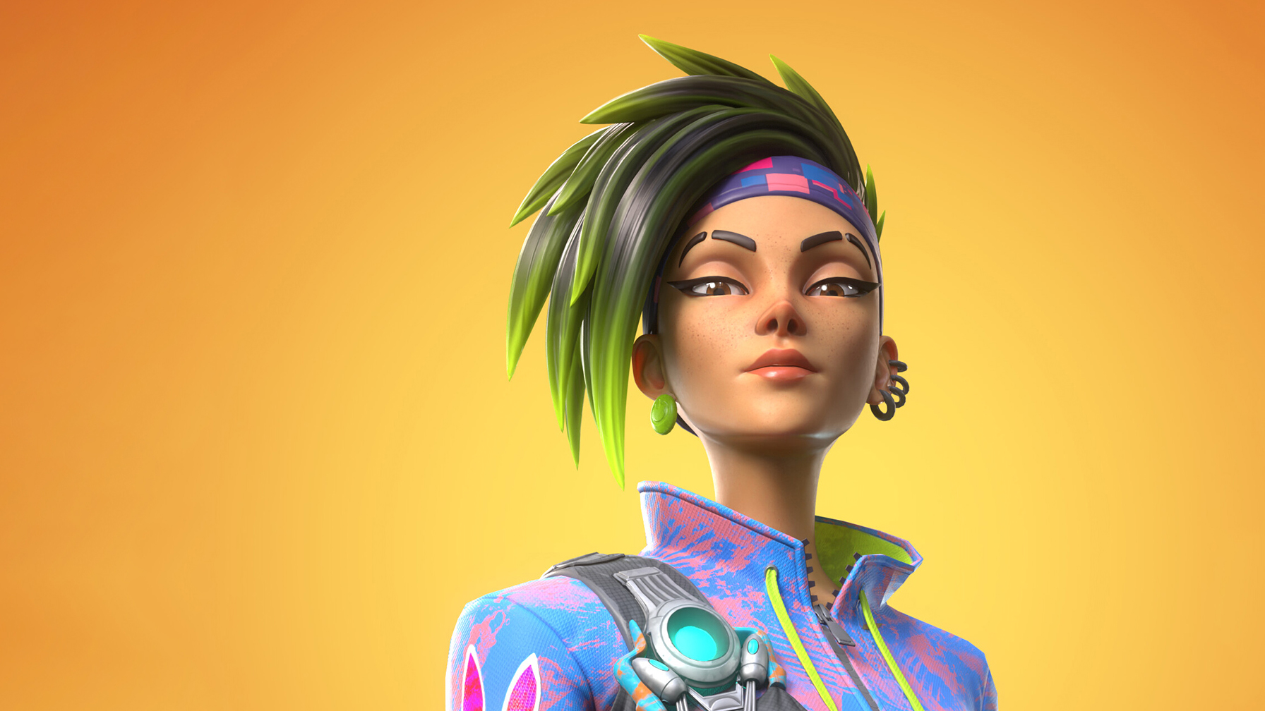
Hey guys! I’m Gabriel Lopes, a Senior Character Artist from São Paulo, Brazil. I currently work for Roarty Digital, making characters for Fortnite. In this article, I’ll present the process behind creating stylized characters, using my 3D character project “Fate” as an example.
References and Concept
The first step is always choosing a concept. At this stage, I look at where I want to take my portfolio and which skills I will be able to improve during the process. I look to create different textures, intricate models, and things that will challenge me throughout the process.
After choosing the concept, we must always gather references, as they will help guide you throughout the process. For this project, I chose a 2D character sketch by Mauro Belfiore. My mood boards consist of everything that correlates to the project somehow, not only for the final look but also for each specific step of the process, such as high-poly modeling, textures, lighting, poses etc.
For “Fate,” I gathered art from Fortnite and Overwatch, stylized work from friends, finished high-poly models for characters such as Sombra and Mercy, and other projects that achieved the look I was aiming for. Then, all references were organized according to each step of the process.
Modeling Summary
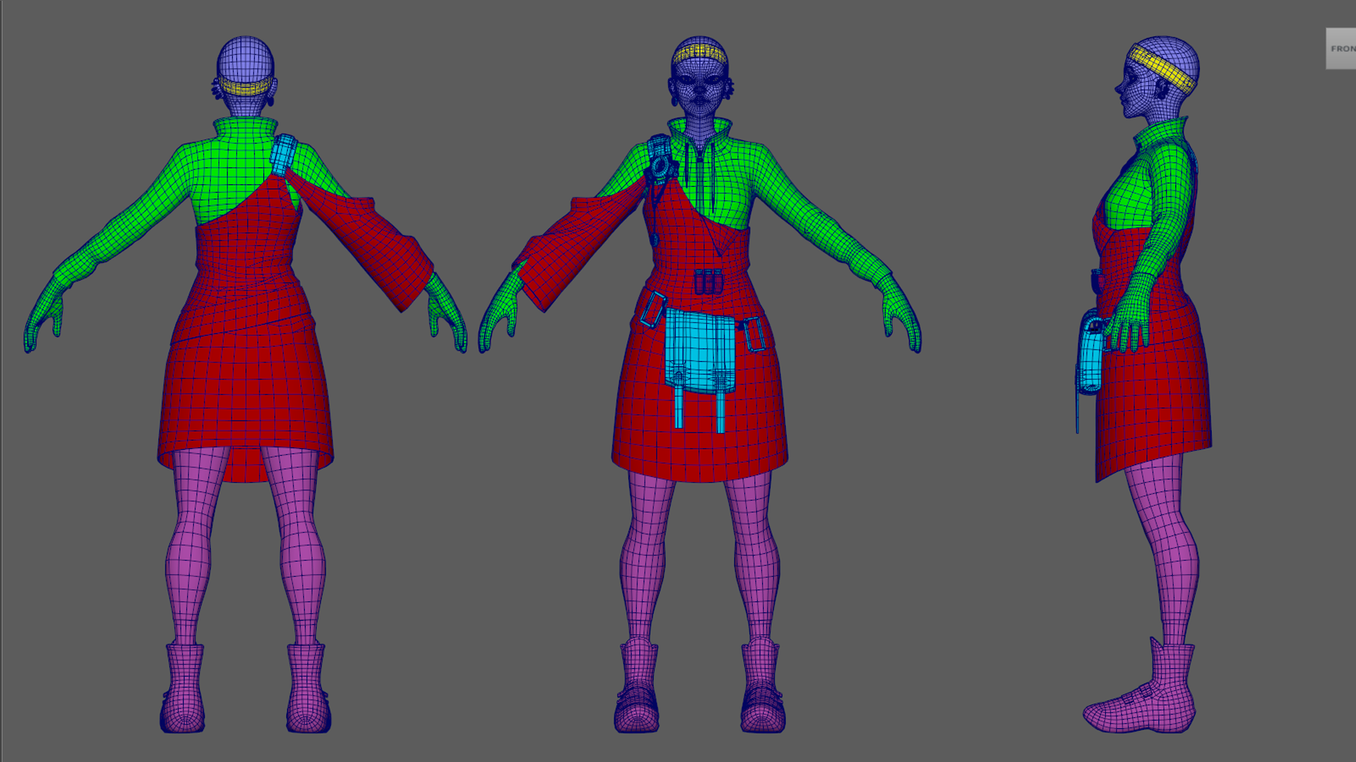
During the modeling process, some steps happen in parallel. So, while working on the high-poly character model, I also created a scene in Toolbag with lighting tests and constantly checked how the model looked in the scene. I always try to have a couple of diffuse lighting tests, usually composed by only one HDRI, and one with more contrasted lighting where I use a direct light with a smaller source so it creates sharper shadows. This aims to see how the volumes react to different environments and lighting in engine.
At this stage, testing different poses, including the pose you intend to use in the final renders is extremely helpful. These tests will show potential problems with the model and whether the proportions feel right. If the character has armor or a bunch of hard surface props, you can test how they would move and fit into each other. This lets you expand on the concept you are working on, not only translate it 1:1, since translating the concept art may not always yield the best result. I made several alterations for this character to suit the Overwatch look best.
I don’t want to go in-depth into creating the character model as a proper game character because I feel that much content already covers this matter. In short, Fate is 80K tris total and has seven 2K UDIMS. I generally work more optimally, but I like to work with fewer restrictions for personal projects.
Look Development
When working on a stylized character, the main goal of the look dev is to create something appealing and interesting. I like to explore a more exaggerated specular look and subsurface scattering. Any textured weathering should be intentional instead of procedural, so the damage, weathering, and other textured effects should create interesting shapes.
The skin setup here is pretty simple. The only maps used were albedo, roughness, and normal. The most important aspect is adjusting the Scatter Depth and Anisotropy sliders in the Volumetric Scattering shading model to suit the model.
Regarding fabrics, I approach stylistic cloth shading differently than realistic ones. I don’t use the microfiber workflow. In this case, I enabled the Reflectivity > Specular shading model and raised the Intensity, which tends to have a more appealing and eye-catching result. I also added a Roughness Map and tweaked the Roughness slider to my liking.
The hair shader was a big back-and-forth process. Ultimately, I used multiple maps to have the maximum control over its final result. The look was generated using a combination of the Reflectivity and Clearcoat shading modules, both driven by specular maps that only included specular highlights where I wanted them. I didn´t need an Anisotropy Direction Map for this case because the slider gave me a great result, but I would normally include one to have full control. I also included an Emissive Map in the Emission module to make the hair tips glow slightly.
Stylized Lighting Setup
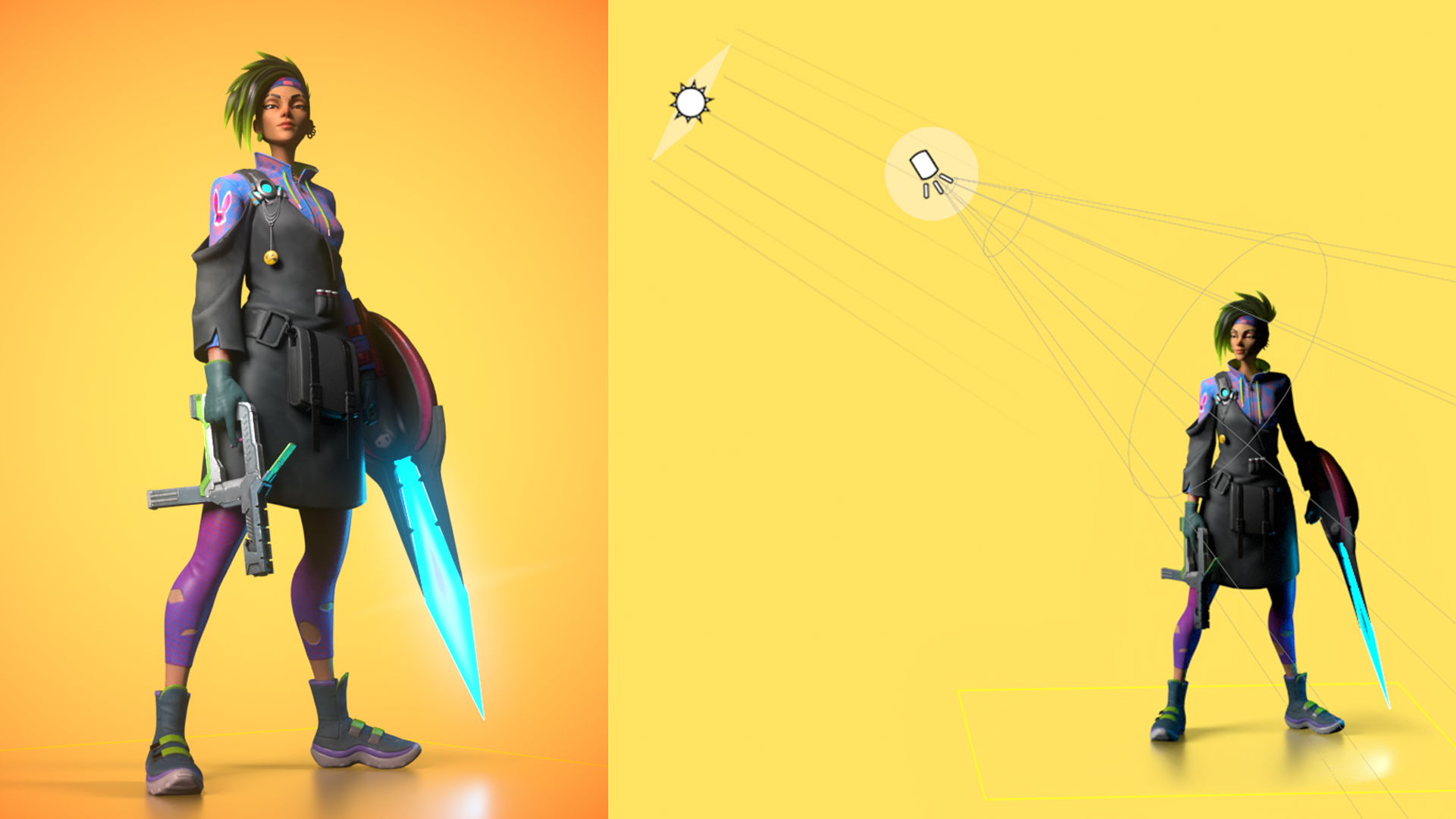
The lighting starts with a basic 3-point setup: the primary, fill, and rim light.
The primary light is the most important one, as it defines the general direction of the lighting, the main volumes, specular detail, and helps create a very cinematic final look. Using this light, I aim to light about 40% of the character, leaving enough room for the other lights to create more volume and highlights.
For this light in particular, I remember placing it to create Rembrandt lighting on her face, which was enough to light the rest of her body. I used a Directional light with a Diameter of 4.4 and a Spot light to control the specular and shadow areas more.
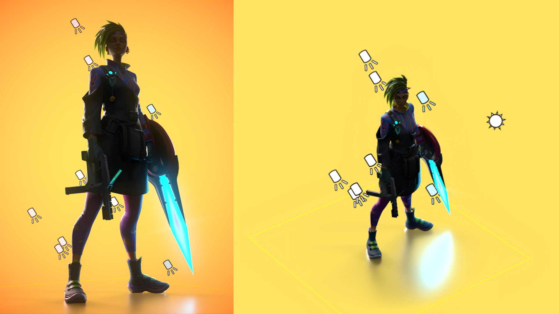
I like to make the rim light as sharp as possible to create a stylized look. At this stage, I use fewer lights for realistic characters, accepting that one directional light would give me a rim light. However, to create a highly appealing look, I use a bunch of smaller Spot lights to separate every area of the character from the background and give it another level of volume.
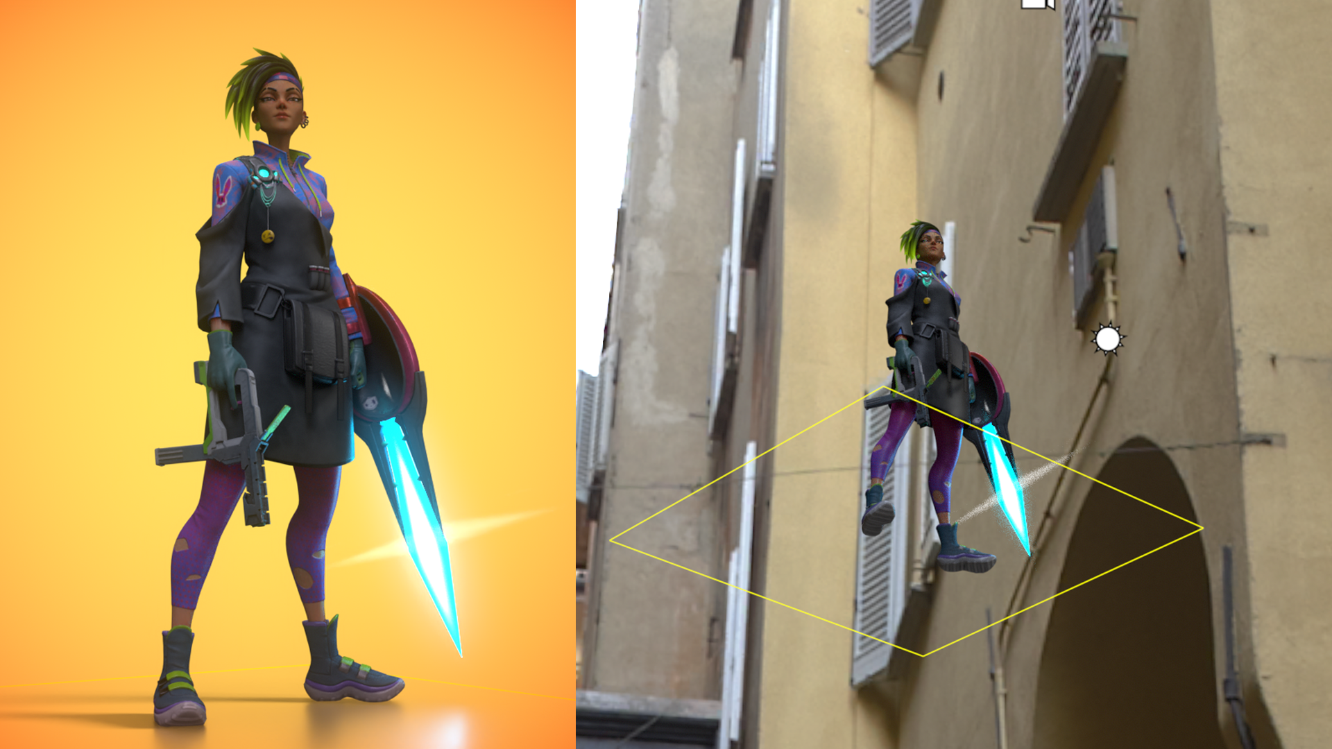
The fill light is the simplest of the three lights. I add a Sky Object and use the Alley Bikes sky from the Library, then add a child light in the Light Editor when necessary. The fill light eliminates pitch-black shadow areas, and the environment adds more specular information to the highly reflective materials in the scene.
Post-Processing and Final Renders
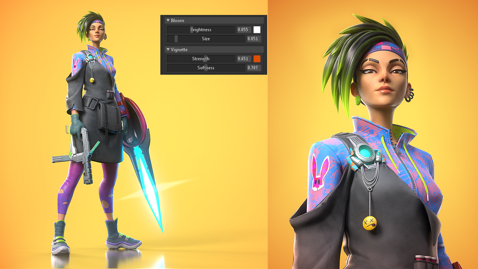
This character doesn’t have much post-processing, but the few effects I added were key to making this render stand out. In Camera > Post Effects, I increased the Bloom slider, which makes the emissive details pop. I also added a colored Vignette to add to its vibrance.
Closing Thoughts
I am aware that some of the skills discussed in this article may not be used in the day-to-day of a character artist. Still, it’s extremely important to portray your characters in a way that stands out for a portfolio reviewer or in the Artstation feed. I strongly encourage everyone to take their time and create the best lighting and presentation possible of their characters
Thank you for reading this entire breakdown, Marmoset’s reaching out and showing interest, and Mauro Belfiore for creating the concept. Toolbag is a great tool that gave me a lot of control over shaders in a straightforward and simple-to-use manner and a quick way to preview my character throughout the entire pipeline.
We would like to thank Gabriel Lopes for writing this breakdown. You can find more of Gabriel’s work on Artstation. Present and render your characters in Toolbag using the 30-day trial.
If you’re interested in collaborating on a tutorial or breakdown article, please send us your pitch and a link to your artwork to submissions@marmoset.co.


