Introduction
Hello, my name is Anton Kozlov and I am a Character Artist currently working in the video games industry. In this breakdown, I will discuss how I created Annabel, a character which is based on an amazing concept by Sergei Gurskiy. I was inspired to create this character in 3D because of the great mix of elegance and strength that she portrays.
Modeling

I started off by creating a rough sculpt in ZBrush, which I retopologized in Maya before bringing back to Zbrush to continue refining it. This allowed me to create a mesh that I was able to use while polishing the sculpt and also as the final mesh. I made sure to keep the topology as clean and as even as possible. I had gone through many iterations during the sculpting phase, adjusting proportions, and working on a base pose that was close to the one portrayed in the concept. Doing this gave me the best sense as to whether her forms would translate well in the end.

I created the base mesh of the hair model in Zbrush to get an idea of her final appearance. I knew this would undergo several iterations once I started creating hair cards, so I made sure not to get too detailed at this stage.

I modeled the tassels of the epaulets as tubes because the intention was to use the character as a portfolio piece. If I was modeling her for a game, I would have chosen to model them as planes with alpha transparency.
Texturing and Materials
Hair

For hair and eye creation, I used the same methods found in the breakdown articles written by Vadim Sorici and Emmanuel Lecouturier. The hair cards were all hand-placed, and so far, I haven’t been able to find an easier solution for building hair cards that doesn’t require patience and endurance.

These are my texture maps for the hair cards.
- Opacity
- AO
- Normals
- Specular
Coat Fabric

For the coat, I wanted to create a material that looked soft and thick. The Fuzz texture was created in Substance Painter using 3 fill layers of varying noise textures and a warp to break up the tiling effect. Once I brought it into Toolbag, I changed the Diffusion module to Subsurface Scatter to take advantage of the Fuzz options. Typically, the Microfiber module would have been enough for this, but I found that the Subsurface Scatter settings allowed me to achieve a nice translucent look on the white scarf. The shadows were softened as well, which helped give the fabric a softer look. Cranking up the Fuzz slider was not enough, so I added variation by applying a Fuzz map that I generated in Substance Painter.
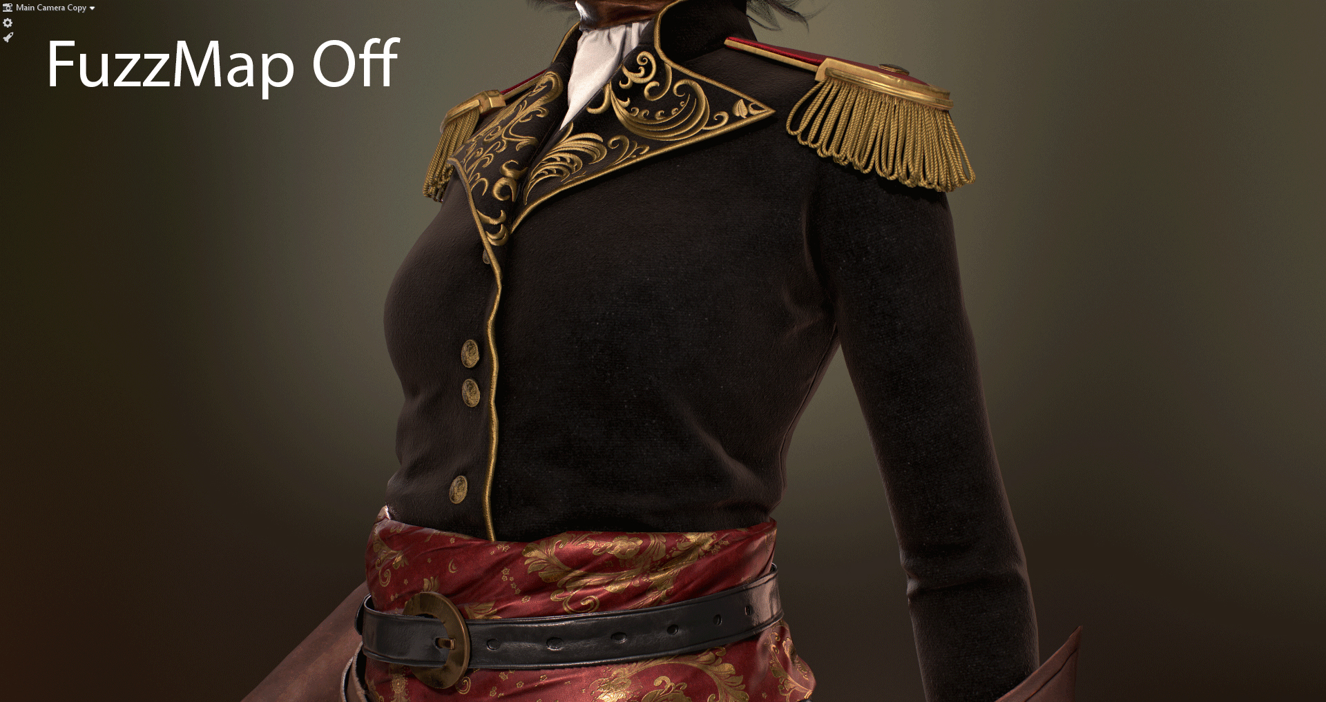
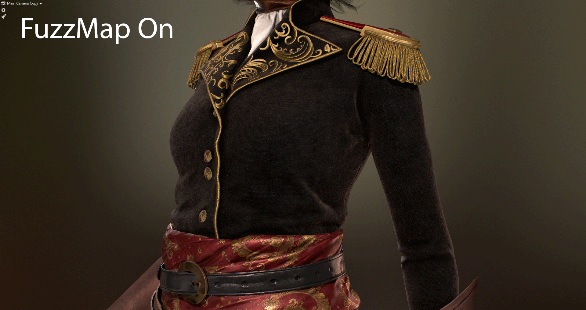
I wanted the fabric to be a deep black color, and I found it difficult to achieve the correct look with Albedo, Roughness, and Metalness maps. The combination of which left an undesired specular reflection. To solve this, I used the Adv.Metalness module in Reflectivity, which allowed me to use a Specular map to mute the effect.

Here are my final texture maps for the coat along with the settings for each shader.
- Shaded
- Albedo
- Metalness
- Roughness
- Specular Level
- Detail Mask
- Normals
- Fuzz
Golden Embroidery

The character design had some elements of intricate gold embroidery. I tried several approaches to tackling this challenge, but in the end, I decided to use a decal. This way I could have higher fidelity in the texture resolution and better control over the tiling details. I changed my Transparency module to Cutout and applied an Alpha map. The designs themselves were sculpted in Zbrush. In the end, I found that using a hand-sculpted approach gave me the most control over the shapes and volumes of the embroidery. After baking the sculpted designs onto a texture map, I created the Albedo/Opacity, Metalness, Roughness, and Normal maps in Substance Painter. I used a material with the Reflection module set to Anisotropic to achieve a golden embroidery look.

This is my mesh and material setup for the golden embroidery.
- ZSculpt
- Albedo
- Gloss
- Height
- Normals
- Opacity
- AO

I used a Height map with parallax to give the embroidery some extra depth. It’s a subtle effect, but I think it worked very well in this case.
Silk Sash

Another challenge I faced with this character was the intricate designs on her silk sash. After some experimentation, I ended up creating baroque style floral patterns in Substance Designer and later brought them into Painter to use as a mask to apply the golden floral designs on the sash. In order to achieve the silk look, I used the material with the Reflection module set to Anisotropic.
The final pattern design was a combination of small elements made from simple graphs. In the image above, you can see I created several variations of individual flowers and leaves. I then combined them to create more complex designs. You can download the Designer file here to get a better look at the graph.

This is my material breakdown for the silk sash.
- Shaded
- Albedo
- Metalness
- Roughness
- Normals
Sword and Cane

The sword was modeled in Zbrush and textured with Substance Painter. The materials have a fairly simple setup based on the Metalness workflow.

These are my maps for the sword.
- Albedo
- Metalness
- Roughness
- Normals

Similar to the sword, the cane was also modeled in Zbrush, re-topologized in Maya, and textured in Substance Painter using the metalness workflow.

These are my maps for the cane.
- Albedo
- Metalness
- Roughness
- Normals
Platform

I wanted to give her a platform to stand on and I decided that wet cobblestone could set a good mood. The ground is a simple plane with a cobblestone texture and an Alpha map applied to help break up the edges. All of the textures for this element were created in Substance Designer.

- This is a screengrab of my material setup in Designer. You can find the file here if you’d like to take a closer look. I am by no means a Designer guru, but I hope this can help you in some way.
- Albedo
- Normals
- Roughness
- Height
- Opacity
Posing

I chose to pose the character in Maya using a very basic skeleton setup. The pose was created as a single frame animation. Although it does require extra time to set up and skin a character, I believe it paid off in the end. I was able to play with the pose as much as I wanted while having the ability to go back to the original base pose and tweak the mesh when needed. Working on posing my character revealed what was lacking and gave me more clarity on how my mesh would look in the final product.
There are limitations to using bones and skinning, especially with extreme poses. In the case of this character, the neck is rotated quite far, which made it difficult for me to maintain its volume. In order to get around that, I used corrective blend shapes. Doing this gave me more freedom when using bones to find a pose that felt right and to further polish the mesh.

Once I was happy with the pose, it was time to import my character into Toolbag. In general, Toolbag makes this process pretty smooth. I simply selected the character and bones, exported an .FBX file with animation, then imported it into Toolbag. One important thing to keep in mind is the framerate. Make sure to set the framerate in Toolbag to the exact one you used in your 3D package. Even though I only had a single frame, I still saw discrepancies in the pose because I had set a different framerate in Maya.
Rendering

Now was the time to light and render her. I started by finding a Sky Preset that worked well, which ended up being the St. Nicolas Church preset. It provided a nice ambient color and made for a nice background when blurred. To blur the backdrop, I set my Backdrop Mode to Blurred Sky and turned up the Backdrop Blur slider.
For the rest of the lighting, I used a Spot light as a key light and Omni lights for a backlight, rim light, and other smaller lights to accentuate the parts of the character that I felt needed emphasizing. I wasn’t concerned with the lighting being realistic, as long as it gave the composition a good feeling.

As a final step, I adjusted the Exposure and Curves to give the image a bit more punch. I used the Speedy Viewport Mode extensively, which was a huge timesaver since my PC is a little old and cannot handle all of Toolbag’s bells and whistles enabled (AO, Global Illumination, and Shadows set to Ludicrous). This allowed me to quickly check my composition and toggle between high and low quality lighting.
Conclusion

I found Toolbag to be a very powerful tool that integrated smoothly into my character creation and look dev pipeline. The ability to quickly set up materials and preview your character in a lit environment is invaluable to having a fast PBR-based workflow.
Thank you for reading through this breakdown. The whole process of creating this character was hugely educational for me and I really hope I managed to share some lessons learned with this breakdown.
I’d like to send a huge thank you to Sergey Gurski for his amazing and inspirational work, the artists who took the time to share their knowledge in their breakdowns for Marmoset, and to the Marmoset team for giving me the opportunity to write this piece.
We’d like to thank Anton Kozlov for writing this breakdown article. You can check out more of Anton’s work on Artstation.
Discover how you create beautiful setups for your characters using the 30-day trial of Toolbag.