Introduction
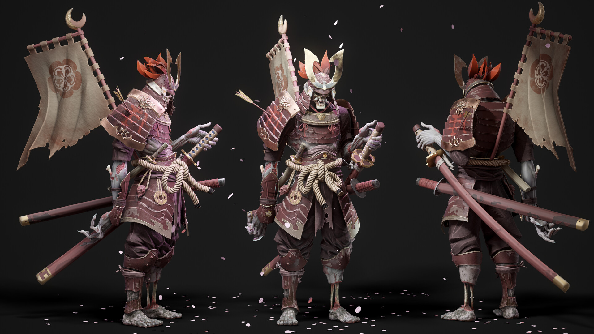
Hello, I’m Ackeem Durrant, a 3D character artist working in games. I’m always trying to improve through personal work and lately, I’ve been focusing on my presentation skills. In this breakdown, I’ll go over the pipeline, thought process, and art direction behind one of my latest characters, Skeleton Warrior.
Picking the concept
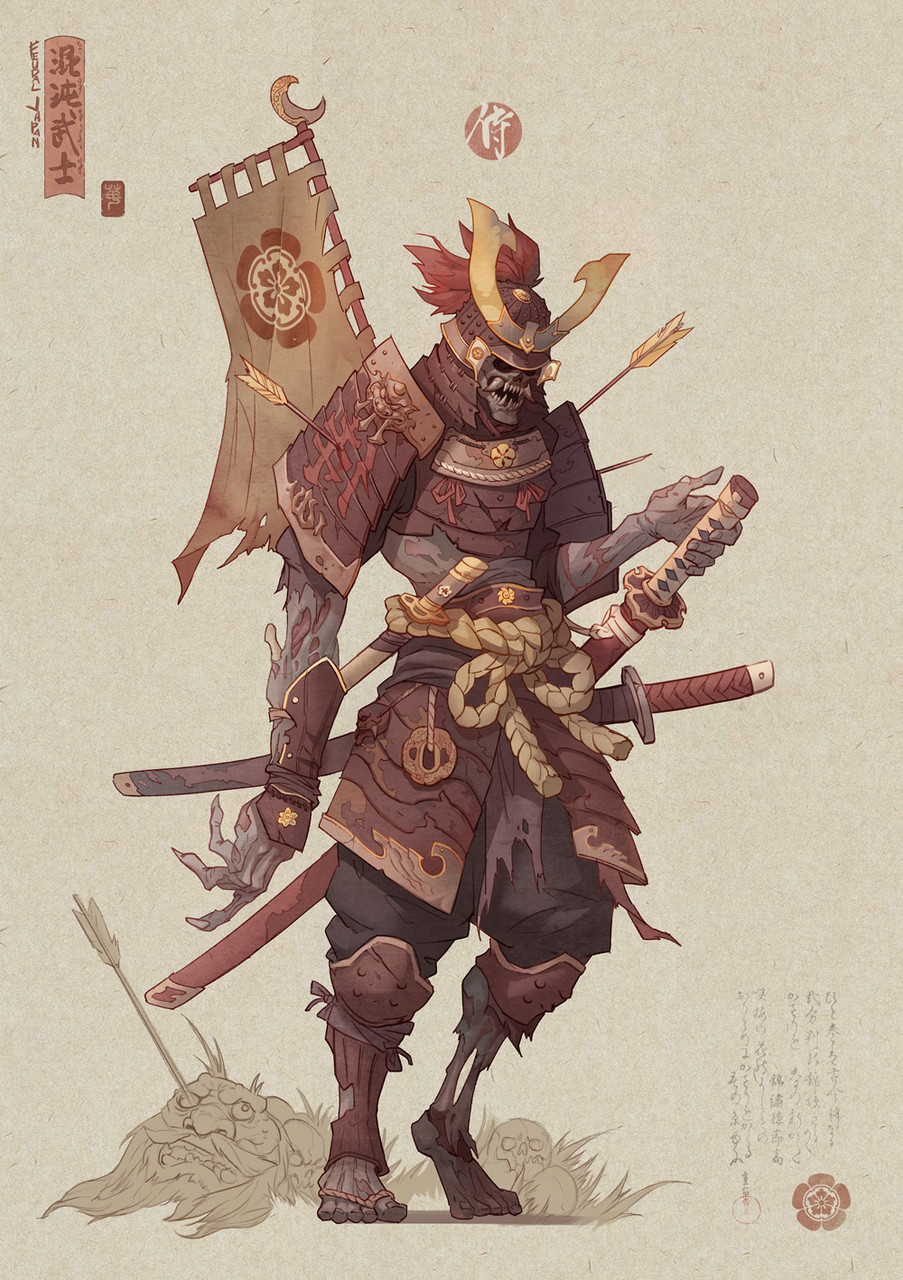
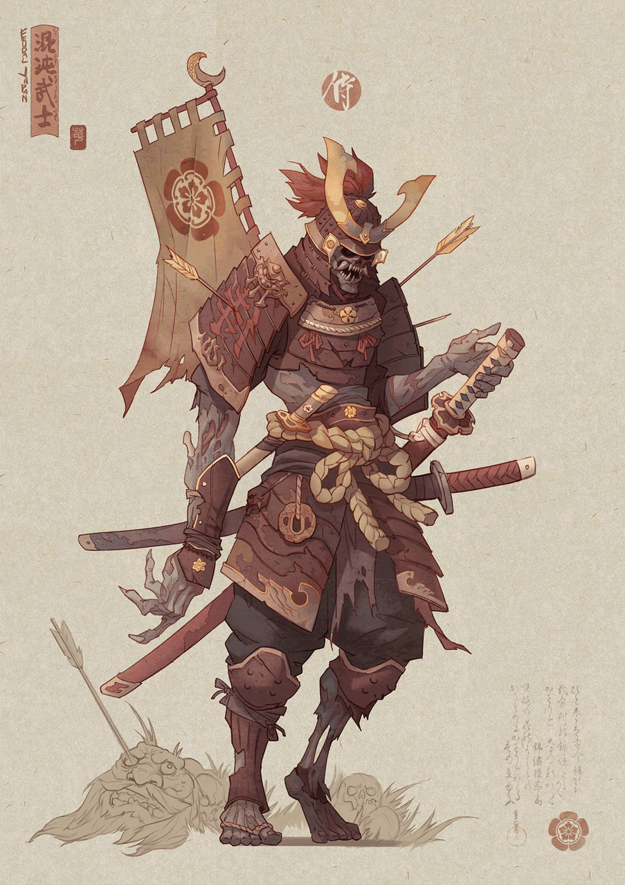
My initial reason for making this character was for the Feudal Japan: The Shogunate Artstation challenge. I had tons of brilliant, new concepts to choose from, which ultimately made selecting one even harder.
The artist behind my chosen concept is Hua Lu. His characters worked for me because they weren’t overly detailed or too loose. This meant that I could explore styles and levels of detail as I saw fit without straying from the feel of the concept, while still making it my own.
PureRef is my software of choice when it comes to collating my reference. For me, reference collection is a 2 part process. The first involves visually spelling out my concept; making sense of it all and knowing what each line in a painting can be. Secondly, it’s about leading me somewhere new. Maybe there’s a photographer that captured a feeling with composition and colour that I’d like to try, or an artist who creates abstract forms that connect emotionally more than if it were realistic.
Organization
Organization is key for any artist. Put everything in a folder, name everything correctly, use version numbers (e.g. _01), and try to keep your folder structure the same for every project. This helps to speed you up as the years go by and makes revisiting old projects a lot easier. I start every project by going into Maya > File > Set project and then placing the project structure in a folder on my hard drive for the character. This way, you have folders set up for everything you will need; images, videos, assets, and it’s the same for each project.
Blocking out the model
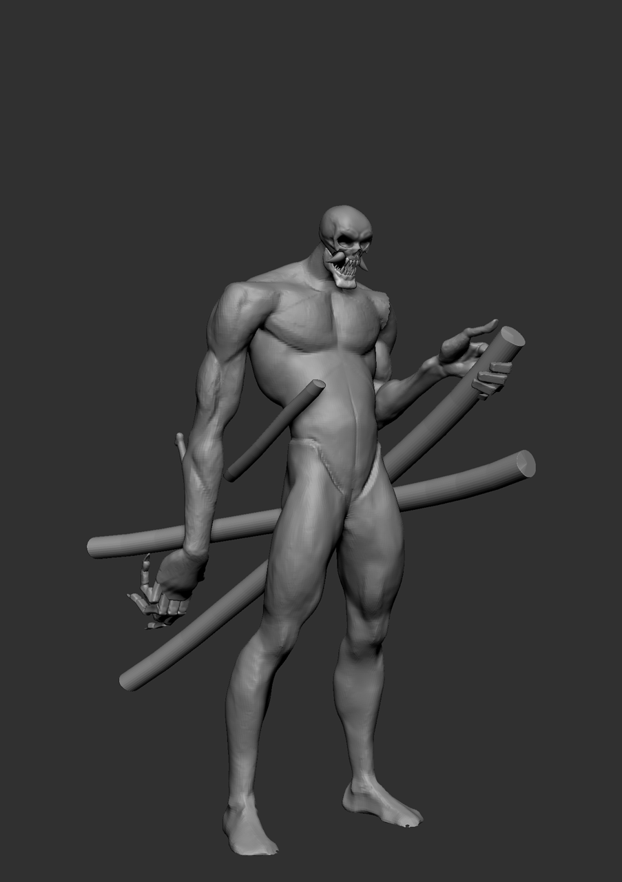
When I begin modeling a non-human character, I usually go straight into matching the concept as close as I can by setting up cameras in ZBrush along with using see-through mode. I do this because I can lock down the overall proportions easier and it makes you appreciate the concept artists intention a lot more. Examples of this for me were how much impact the hands have, the length of the arm, the S shape throughout the body, and how broad the shoulders are. The other aspect of this blockout process is setting my limits. After blocking in the body, I blocked in the sword cases, so now I had my inner and outer limits, because nothing should penetrate the body or go beyond the sword cases. These become my rough guidelines, which I sometimes break when needed, but they still help.
I love anatomy, but at this stage, I don’t worry about it too much. I make sure to add structural landmarks like the thoracic arch, clavicle, and in the pelvis. What’s more important are the forms, which should lock together and flow naturally with clear intent, whether that be relaxed, tense, or angry. I break the anatomy as instructed by the concept and then make sense of it later.
The final thing I worry about at this stage is the thickness of assets. This is very important because thinner objects lean towards realism and thick objects lean towards stylised. I think the concept has a very nice balance of both elements and I wanted to keep that.
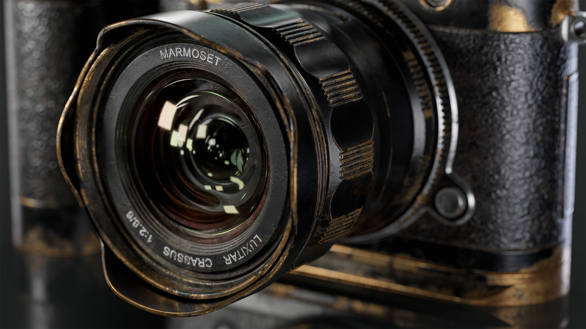
Marmoset toolbag test scene
I get a Toolbag test scene up and running early in every project because ultimately, this is where our asset will be displayed. I set up a camera and create different lighting scenarios to see if I need to sculpt details deeper based on the shadows, make edges thicker, or change proportions based on my ideal camera (which changes over time).
Lenses play a big role during this stage. If I use an 18mm lens, there will be a ton of perspective distortion compared to a 150mm lens, which gives very little distortion. This impacts the composition, silhouette, and mood of the final render. Experimenting early on always helps with these decisions, and it’s the easiest time to iterate and explore since there are no commitments.
High poly model
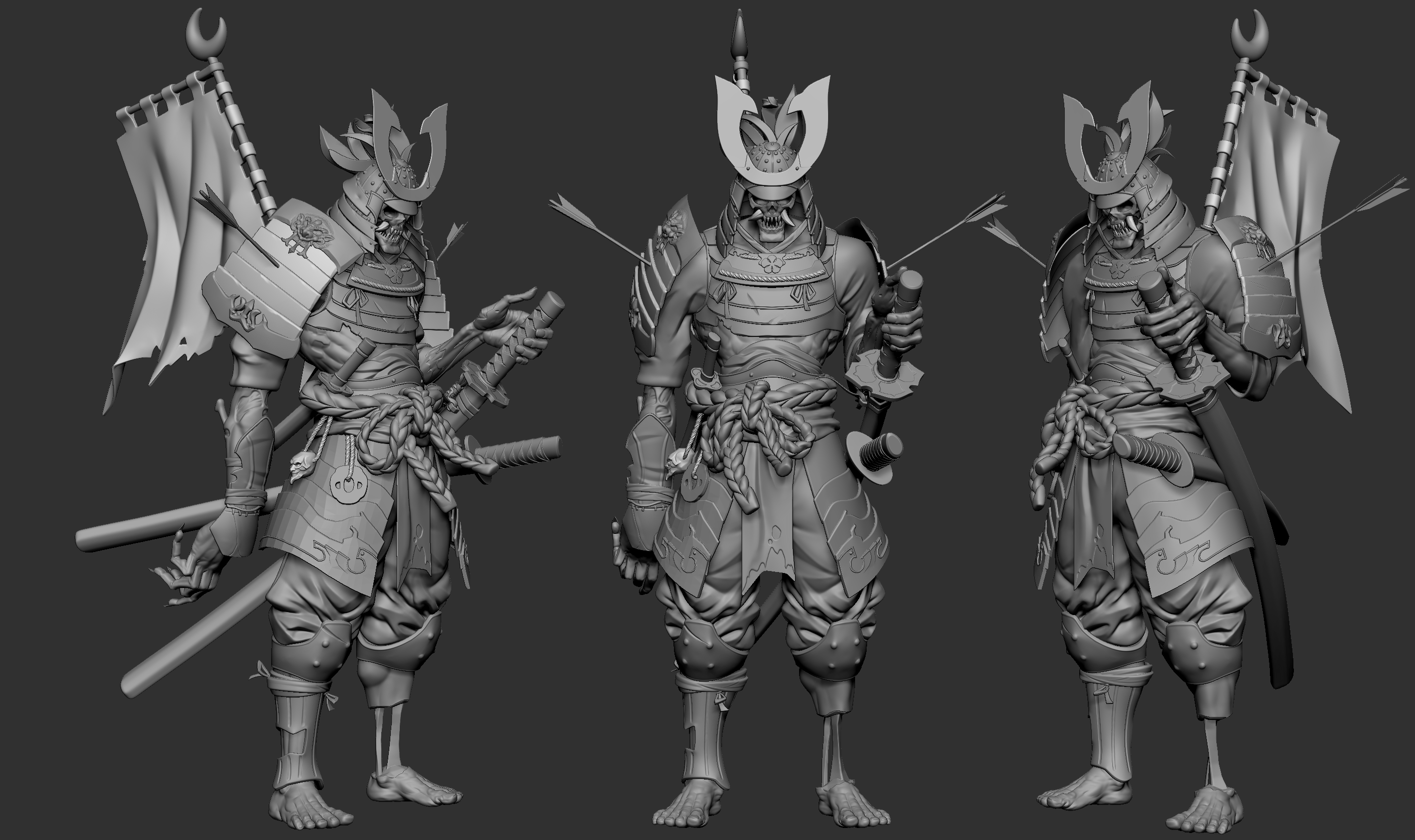
I specifically decided to leave a lot of the details out for this high poly model. This decision was based on the concept and style references I had, because the shapes are so big and bold that the main focus will be the overall readability of the forms. This is similar to most animated feature film characters that have simple, appealing shapes juxtaposed by tons of details.
I name my high poly meshes at this stage and add the suffix _high to ensure that I can speed up my baking pipeline in Toolbag or Adobe Substance Painter.
Retopology, UV’s, and asset management
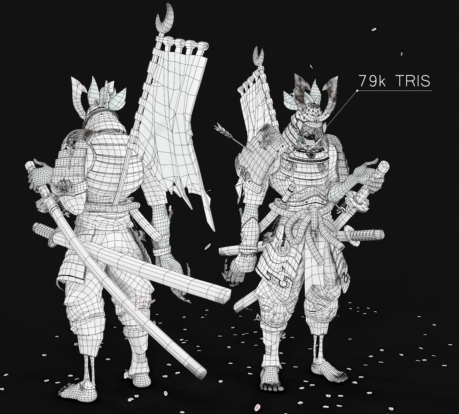
Once I’ve finished creating my high poly, I decimate all of my assets in Zbrush and export the correctly named models. I decimate these as low as I can without losing the shape. These assets are then imported into Maya where I do my retopology using Quad Draw. A lot of artists begin with ZRemesher, but I find that after I clean up unwanted edge flow and geo, it’s roughly the same time per asset if not slower.
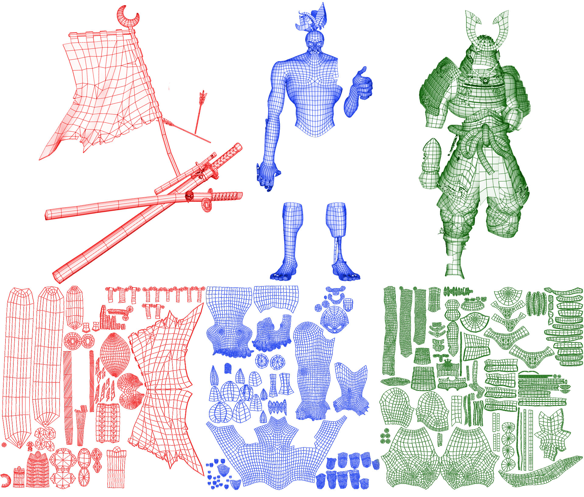
After retopology is complete and all of the assets are named correctly with the suffix ‘_low’, I group assets according to how I plan to UV them. For this project, I had the armour and clothing in one group, body in another, and a few assets in a group called extra. I sometimes just group by materials, but I knew how I wanted to organize the elements when working with texture sets in Adobe Substance Painter, so I went with these.
Finally, after my groups are defined, I lay out my UV’s. Each group is on one sheet, so I try to get even texel density where it makes sense and use up all of the space.
Baking in Marmoset Toolbag
Baking maps in Toolbag is very simple and intuitive. There are a few benefits, such as the automatically generated cage that updates in realtime as you make changes. You can have even more control by painting a skew map that alters the direction of rays being traced. Here are my simple steps for baking in Toolbag.
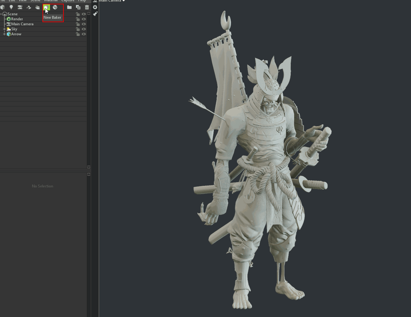
I create a separate Toolbag scene dedicated for baking. Once you have your new scene, hit New Baker to create a baking folder.
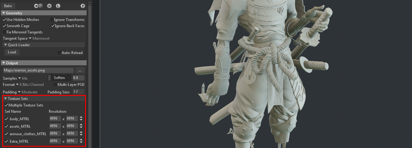
Select the baker and make sure to check the Multiple Texture Sets option so your assigned materials from your 3d package are recognized and baked to the correct maps. Set your desired map resolution as well.
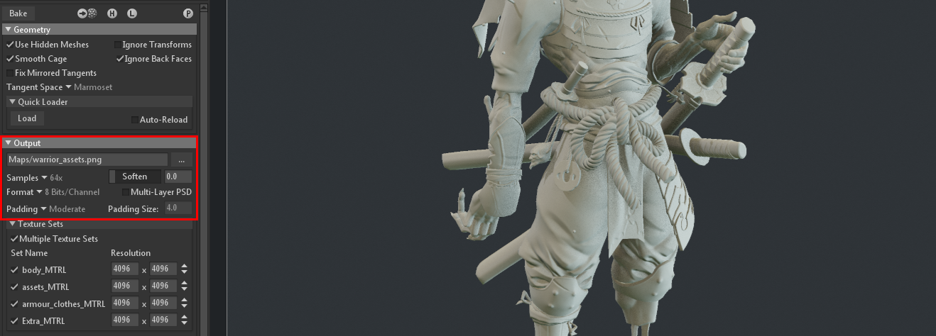
Go to Output Settings and specify a location to save your maps, then change the remaining settings to your liking. I go for 64x Samples at a Format of 8 Bits with my Padding set to Moderate.
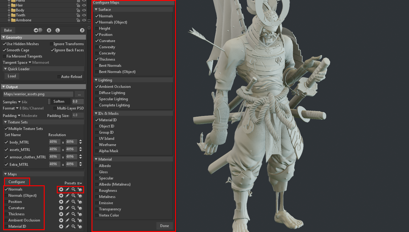
Next, select the Maps you’ll need to bake. Clicking Configure allows you to see the full list of maps you can bake. Next to each map, there are icons to change the map settings, edit or view the bitmap texture, and viewing the texture on your low poly model.
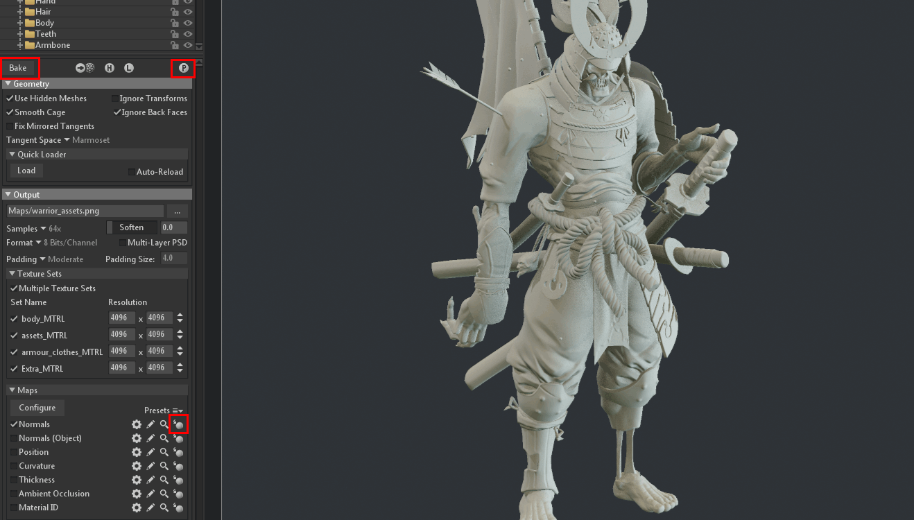
Bake your maps by pressing Bake at the top of your baker settings and press the Preview icon to automatically assign the maps to their corresponding shaders. At this point, if you press the Preview in Viewport option, your map will appear on your low poly model.
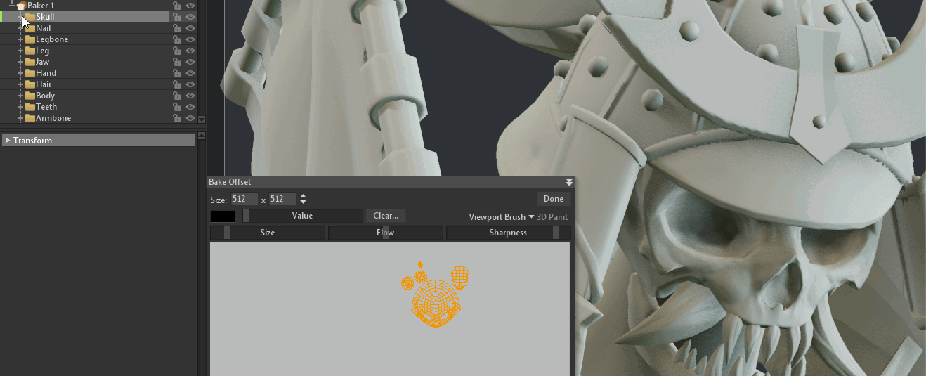
Finally, check your baked textures. If there are any errors, go into the affected baking groups and select Low. This will allow you to manipulate the cage and paint your skew maps to fix any issues.
Material creation
For the materials in this project, I wanted to keep the muted colour palette in mind. An easy pitfall would be to have values that were too similar, which would make the image flat. My way around this was to exaggerate the underlying materials and add contrast with the roughness and colour maps.
Wood
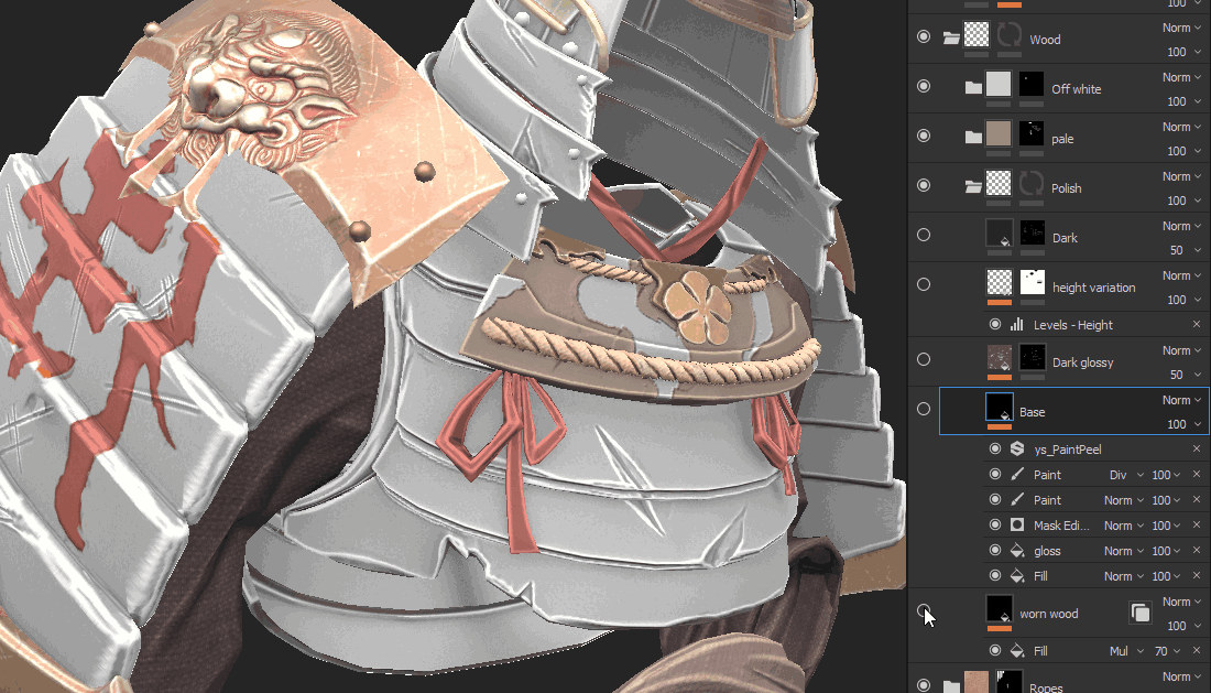
I exaggerated the glossiness of the red coat and made the underlying wood rougher. This helped to sell the feeling of damaged samurai armor, as well as the glossy dark spots promoting the idea that oil and grime has built up on the surface.
Metal
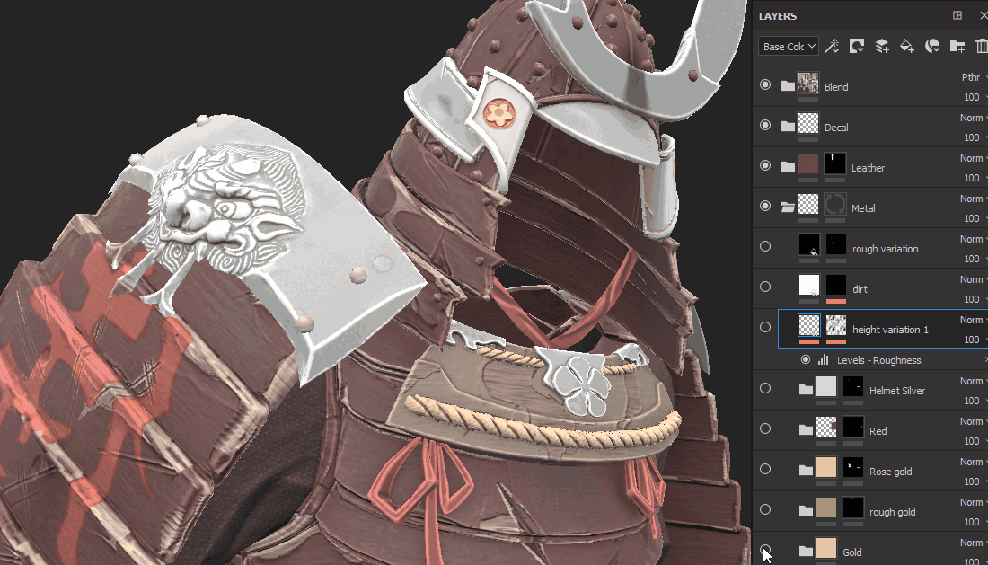
When I saw the concept, I knew I wanted the metal on the helmet to grab the viewer’s eye. This meant that I needed the tip to be fairly glossy. I also liked the colour variation that the concept had, so that was subtly incorporated along with roughness variation. Finally, I added height variation for dents and scratches which peeled away at the coated metals to reveal a steel layer underneath.
Curvature blend
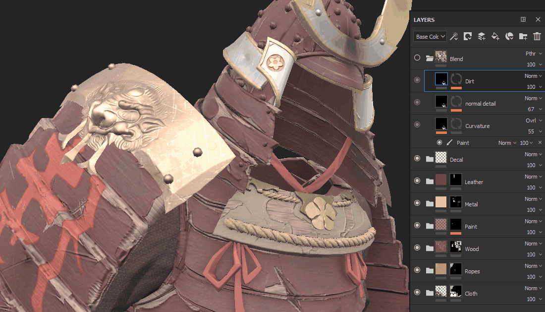
One of my most important layers was the curvature blend layer. Because this was a stylised character and I wanted broad variation without going in and highlighting every layer, the curvature map was used as an overlay on top of the other layers to make edges pop and add interest to otherwise flat areas.
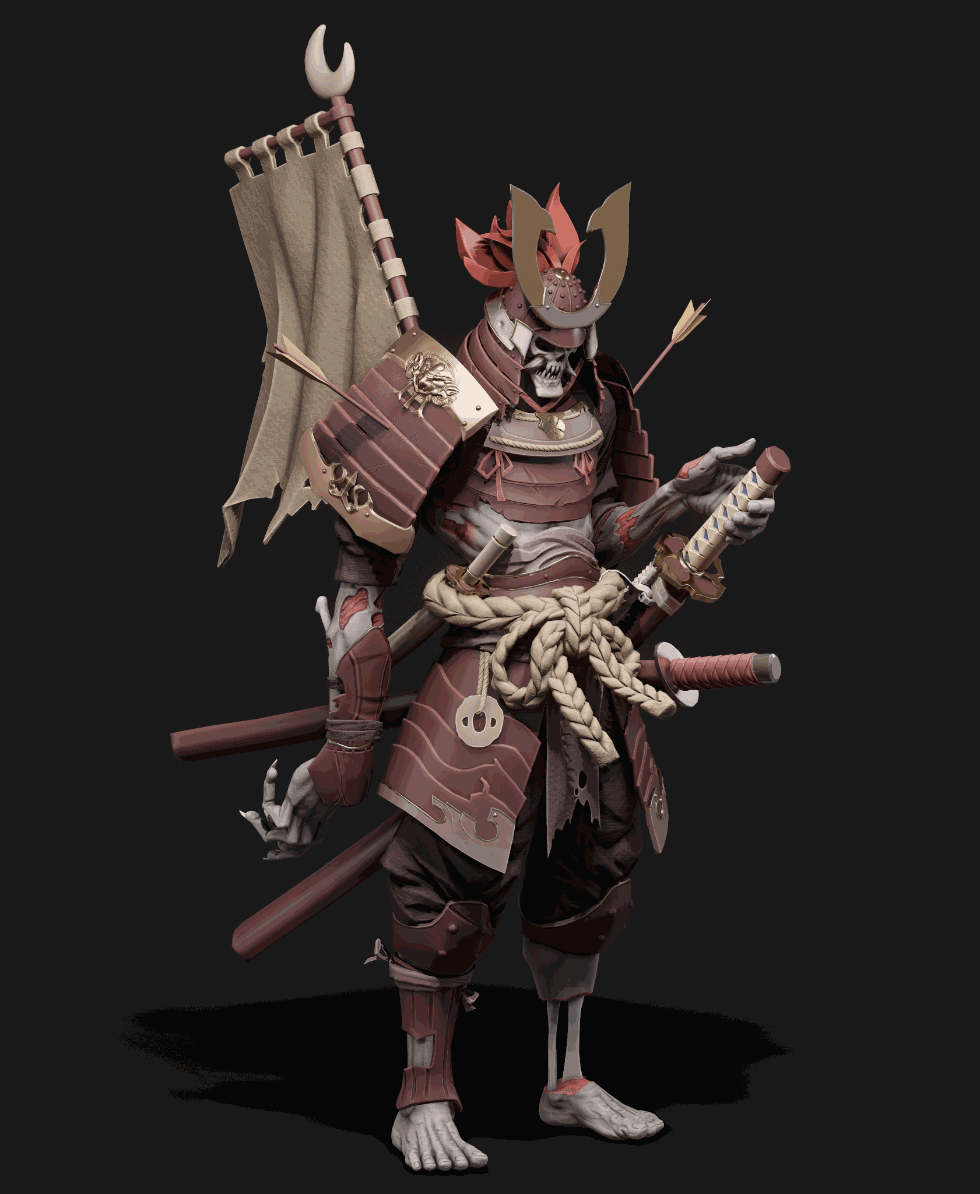
Look development and presentation
Final camera
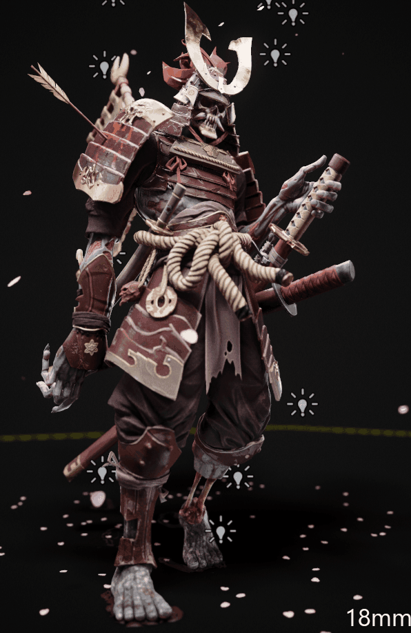
My final camera was positioned very similarly to the original concept, but I did place it lower to the ground and reduced the focal length to 33mm. This made the model feel more imposing. After doing this, I noticed that he just felt like a bad guy looking for someone to kill, so I added in the cherry blossoms to alter the feeling of the image. It didn’t change the character for me, but it did suggest that there’s something more to him. Cherry blossoms symbolise fleeting life, and that metaphor adds more thought to the image. For me, that’s always a positive.
Lighting
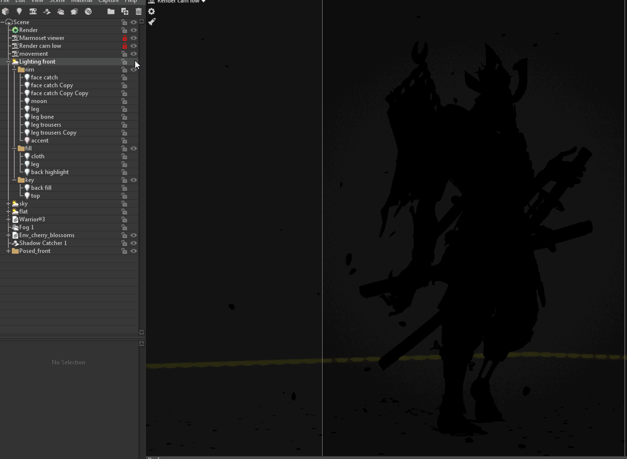
For this project, I began using a new approach to lighting. I always heard people talk about sculpting with lights and I wanted to give it a try.
In this project, I used my HDRI as an ambient light, it added a subtle colour shift and brightened up my shadows similarly to my fill light. Key lights were used to define the overall light direction and areas of interest. Fill lights were used to bring out certain areas, such as the leg and the flag, so they don’t get lost in the shadows. Rim lights were used heavily for this character to separate it from the background and help lead the viewer’s eye. I turned the Distance slider of certain lights down to specify the area that I wanted lit and reduce bleeding to other areas. This made them easier to control.
Render settings
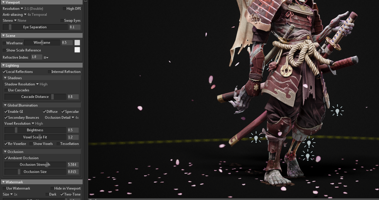
I don’t have anything too special happening in my Render settings. My Resolution is set to 2:1 (Double), Local Reflections are on, and Shadow Resolution is set to High (with the new version of Toolbag, I now set this to Ludicrous). I enabled Global Illumination and set the Occlusion Detail to 4x, but reduced the Brightness to 0.5. Finally, I turned on Ambient Occlusion and set my Occlusion Strength to 5.5 and the Size to 0.015 to keep it tight.
Testing ideas and feedback
Don’t be afraid to test ideas and receive feedback throughout the duration of the project. For this project, I tried different environments, various flowers, and tons of material types. Iteration is part of the process, and whenever possible, don’t rush art. You’ll learn a lot more that way.
Feedback is vital. I usually wait until I am in the last 2-3 weeks of finishing before showing personal work. That way, the feedback doesn’t change the direction of the project and I would still have time to act on suggestions. Receiving feedback from professionals is ideal, but I personally always ask my wife. People in the industry usually provide technical input to address, but the general audience will only react to the final image, and at the end of the day, that’s what’s important.
Huge thanks to the amazing team at Marmoset for giving me the opportunity to speak about my work and thanks for reading.
We’d like to thank Ackeem Durrant for writing this breakdown article. You can find more of Ackeem’s work on Artstation.
Weave Toolbag 3 into your workflow and create showstopping renders using the 30 day trial. If you’re interested in collaborating on a tutorial or breakdown article, please send us your pitch, along with a link to your artwork, to submissions@marmoset.co.