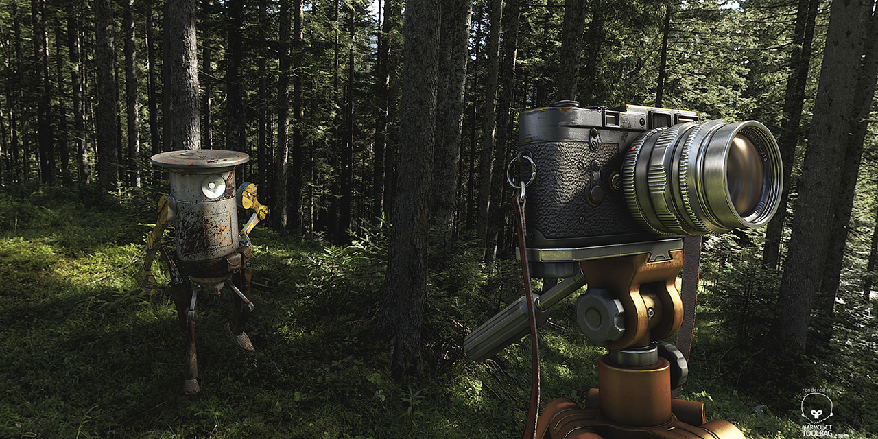
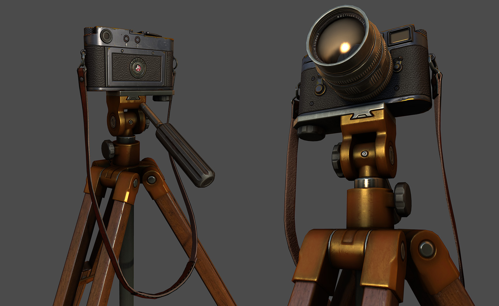
I often get asked how to make “X” material type in Toolbag, so I decided to throw together an asset to help explain how the Marmoset Toolbag material system works and display the type of art content I create to mimic various real world material properties.
Download the camera asset to follow along and view in full 3D glory inside of Toolbag, here.
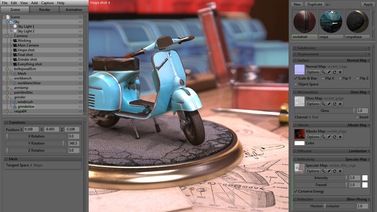
Essential Terms:First things first, this tutorial is covering the Marmoset material system and how to achieve the most from your diffuse, normal, specular, and gloss maps while representing a variety of material types. Let’s start by explaining what each map does and how it will relate to the Marmoset material system. There are more advanced features of the Marmoset Toolbag rendering/shader system, but for the sake of simplicity we’re going to limit this tutorial to the four common texture maps in the default shader. Note: Your specular and gloss values apply to dynamic lights as well as the default environment lighting. |
Diffuse Map – The diffuse map is your basic color texture, here you will define the color information for your materials.
Normal Map – The normal map provides per pixel lighting/shading information. Your normal map will be either generated from a high resolution model, or generated from a 2D bump map. You can add extra normal map detail to your baked map to help further define material properties, with the Nvidia Normal Map filter, Crazybump, nDo and other similar programs. Specular Map – The specular map is used to define both the color and strength of the specular reflection highlights. Gloss Map – The gloss map is used to define the “sharpness” or “roughness” of the specular reflection highlight, essentially how wide or narrow the highlight is. Darker gloss values are used to define matte materials, while brighter gloss values are used to define glossy materials. In Marmoset Toolbag you adjust the gloss value with the “Specular Sharpness” slider, and if you save a gloss map into the alpha channel of your specular map it will automatically use that for your gloss value. Be sure to save a 32 bit image otherwise your gloss map with not load. |
Getting to Work
Preplan: Image Reference

The greatest skill a material artist can have is the ability to see. Learning how to observe image references and real world references is key to being able to reproduce those material types in a game engine.
Before you even think about opening Photoshop, you should have a good collection of reference images and a solid understanding of the material types you want to mimic. This will enable you to recreate any material you could possibly imagine, not just the ones covered in this tutorial.
Must Know: Marmoset Lighting
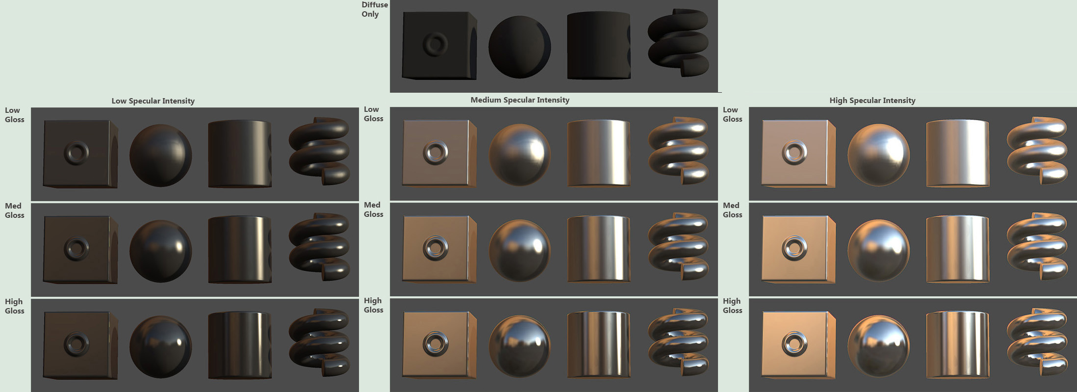
Marmoset Toolbag’s rendering system is a bit different than what you may be used to. The most fundamental difference is that the base lighting system is derived from cube map images, otherwise known as image-based lighting (IBL).
If you’re coming from an engine that doesn’t use IBL, you may be thinking of specular and reflection as separate entities entirely. In Marmoset Toolbag (and the real world) these two concepts aren’t separated. This is why it isn’t possible to adjust specular and reflection independently in Toolbag.
The image to the right illustrates how different “Specular Intensity” and “Specular Sharpness” settings will affect the specular reflection of your texture.
Protip: RGB masks
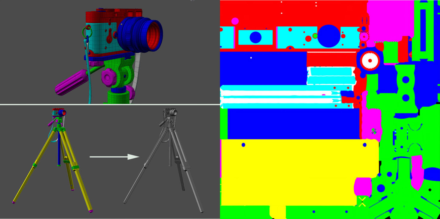
Baking a RGB map from your highpoly model is a huge time saver allowing you to quickly extract selection masks that you can use as the basis of your texture. Assign basic materials to your highpoly objects using red, green, blue, cyan, magenta, yellow and white and then bake that down to a color map along with your normal map.
You can use a Photoshop action to separate the colors into individual layers that you will be able to build your materials on top of. Make sure to use the exact color values ie: 1, 0, 0 / 0, 1, 0 / 0, 0, 1 / 1, 1, 0 / 1, 0, 1 / 0, 1, 1 and 1, 1, 1. Andy Davies (metalliandy) released a nice set of actions which you can find here.
Your RGB bakes should make your asset look like a Nerf gun, otherwise you’re not doing it right.
Theory: The Process
 Now that we’ve got the technical stuff out of the way, let’s go over the theoretical side and my personal process. When you’re creating dynamic materials for current gen games, it’s really important to look at the whole picture. All four texture maps work together and getting convincing material reads is a balancing act. I always work on all of the map types together. The relationships between the various maps are so important that it really helps to work on everything at the same time.
When I’m starting a new material, I’ll set the “Specular Intensity” to a value of about 1.5 (though you may want to tweak this depending upon what type of materials you’re creating), this gives me the ability to use values brighter than 1.0 if I want an area in my texture to really pop out. The Specular Sharpness (Gloss) should be set to 256 (which is the max setting) to ensure your gloss map can control the full range of values
I like to block in all of my values with simple colors in each map before moving on to detail/wear. Doing this first step saves a lot of time, you can quickly see how well your materials read before getting too complex. Set your base materials up first and then stick to those values, adding wear and extra effects as additional layers on top of those values.
 Nailing your material read is more important than how interesting your textures look in 2D. Often times, an asset that has a good material read will look very boring in parts of the texture maps, but that is perfectly OK! Different materials call for different types of detail, sometimes very simple values and flat colors is all you need to define a material. This will vary a lot depending on how much wear your asset needs to have, the style of your game, resolution of your textures, the distance your asset will be viewed from, etc.
After you have your base materials blocked in, you can start concentrating on the little things that really set each surface type apart. In the next section I will review my choices for base values and the thought process behind some of the detail work.
Materials: The Detailing
Brass
 Brass is all about diffuse and specular color. It’s one of those materials that is difficult to represent without full color specular maps.
For the diffuse I used a dark orangish-brown value with some slight greens mixed in around the edges to break it up a bit. The specular is a medium-dark yellow-greenish value with a grunge overlay to give it some variation, and the gloss is a medium value with a different overlay to break it up further. Nothing special for the normals, brass is a smooth material so you don’t really need anything here unless you’ve got larger wear/damage happening.
For an aged brass effect you can add some patina by masking out some lighter green areas in the diffuse, and then darker values in the specular and gloss maps. Start this with the darker values(“pits”) from a cavity/curvature map and then paint in some variation to keep it natural.
Chrome
 This one is fun and easy to do. Here we can see the specular reflections shine.
I think the most common mistake when doing a chrome or other highly reflective metal is making the diffuse very bright. It should be a little brighter than a darker metal, but the brightness comes more from the specular reflection. If you make the diffuse too bright here you tend to lose the material contrast or blow out the highlights.
The diffuse is quite simple, just a medium gray. For the specular I like to use a slightly yellow color to offset the blue ambient that a lot of the Marmoset sky content has. I have a faint grunge overlay here to break it up a little, and I’m highlighting the edges from the cavity map. For the gloss we’ll use a medium high base value to get those sharp reflections.
Now this is a super simple and fun effect: What you need to do is create some noise, use the motion blur filter and align the lines according to your UV layout. This gives you a nice “brushed metal” effect without the need to use a complex anisotropic shader. I added fingerprints and some dust to round it out.
Leather
 Here we have some treated shiny leather, with the natural untreated backing.
For the treated leather we’ll go with a dark brown value and a crackled leather overlay. Since the strap is a thin strip I didn’t want to go with a heavy overlay here. I have included some dark blackish values around the edges to give it that “burnt edge” look. The specular should be even because this is a polished leather material. I’ve added a little of that crackled texture to the gloss for variation, and to the normal map as well. I added some stitching as brighter values in the diffuse, darker in the gloss and spec and then bumped out in the normals.
The unfinished leather should have a brighter more tan value, with some noise to show the roughness of the material. The diffuse and gloss should be almost black because it is a matte material and not very reflective. The normal map has a heavier noise pattern to show the roughness.
Painted metal
 This complex material is composed of 4 distinct layers. First, the brass that the camera is made out of, then a primer, a glossy coating, and finally some fingerprints on top, to finish it off.
The base glossy paint layer is pretty simple, just a dark grey value in the diffuse, you can add some stains or discoloration here. A dark slightly purple value for the spec helps to keep it from looking too monochromatic and then a medium value for the gloss map.
The first layer of wear will be scuffs into the glossy coating, we’ll add these as darker values in the diffuse, spec, and gloss maps. The second layer of wear will be the areas which have worn down to the underlying brass. A dark orange for the diffuse, a yellowish value in the specular, and a medium-high value in the gloss because the wear that caused this area to be exposed will polish the brass as well.
For the normals I added a bit of the two wear layers in, you don’t want to go crazy here or you’ll end up with what looks like huge scrapes. Remember, the glossy coating on something like this will only be a fraction of a millimeter thick, so you wouldn’t have huge flakes of paint coming off. If you go overboard you’ll lose the scale of the object.
The top layer of fingerprints is an easy effect, make yourself a fingerprint brush and then slap a few on, maybe smudge them up a little and then add them to your spec and gloss maps as brighter values. I didn’t add them to the diffuse as you should only really be able to see them from certain angles.
Plastic (Dull)
") This is a really easy material to do. It’s basically just flat colors. Here we want to create a simple material with a dull reflection.
This is a really easy material to do. It’s basically just flat colors. Here we want to create a simple material with a dull reflection.
For the diffuse map, we’ll go for a dark gray, a medium dark-gray with a small amount of noise is used in the specular map, and a darker value of gray makes up the gloss. I’ve also added some dust/grime for variation.
Plastic (Grip)
") This material is similar to the Dull Plastic, but here we’re letting the normal map do a lot of the heavy lifting.
This material is similar to the Dull Plastic, but here we’re letting the normal map do a lot of the heavy lifting.
The diffuse is a simple dark grey. The spec is a medium dark grey, and the gloss is a medium dark gray but the peaks of the bumps have been highlighted a bit more with the cavity map. This material gets touched a lot so the oil from your hands builds up on the peaks, while the deeper parts of the bumpy texture stay matte. I’ve added a little dust for variation, lighting in the diffuse and darker in the spec and gloss.
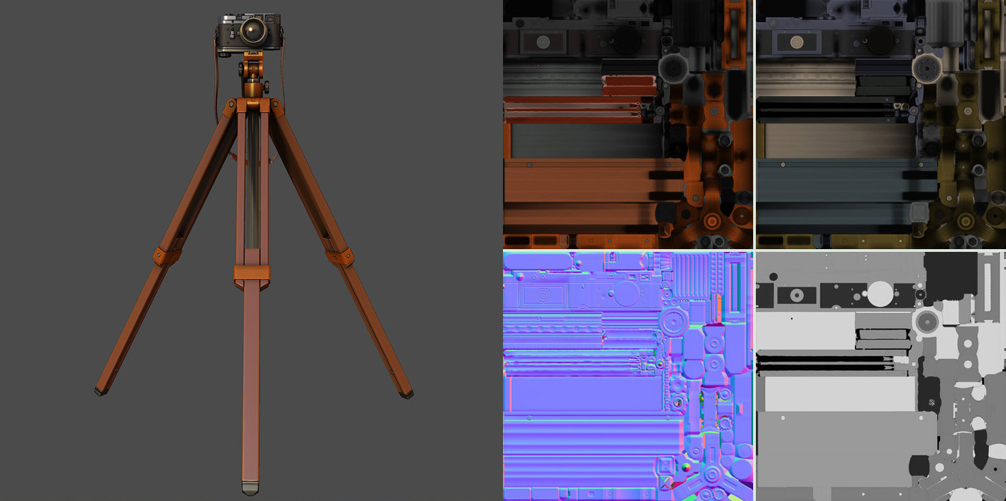
Wood (Lacquered)
") Lacquered wood is another complex layered material. Unlike unfinished wood where you might add a lot of bumpy normal map detail, lacquered wood will have been sanded, stained and sealed with a glossy finish.
Lacquered wood is another complex layered material. Unlike unfinished wood where you might add a lot of bumpy normal map detail, lacquered wood will have been sanded, stained and sealed with a glossy finish.
For the diffuse I go with a nice wood texture, for the specular I use a darker very slightly blue value (to offset the warmth of the wood and give a neutral reflection), you can see I’m not really bringing the wood grain into the spec, wood grain shouldn’t have much affect on this sort of material as the specular reflection comes from the surface of the glossy coating, not the wood itself. The gloss has a medium value to create a nice sheen. Again for the normals, the wood grain and texture shouldn’t pop out too much. For wear I’ve created a layer of scratches and scuffs that is darker in the specular and gloss maps to show where the material has been roughed up and the finish has worn down.
For heavier wear you could lighten up the diffuse around large scrapes to show where the stain would have been scraped off.
Layered effects
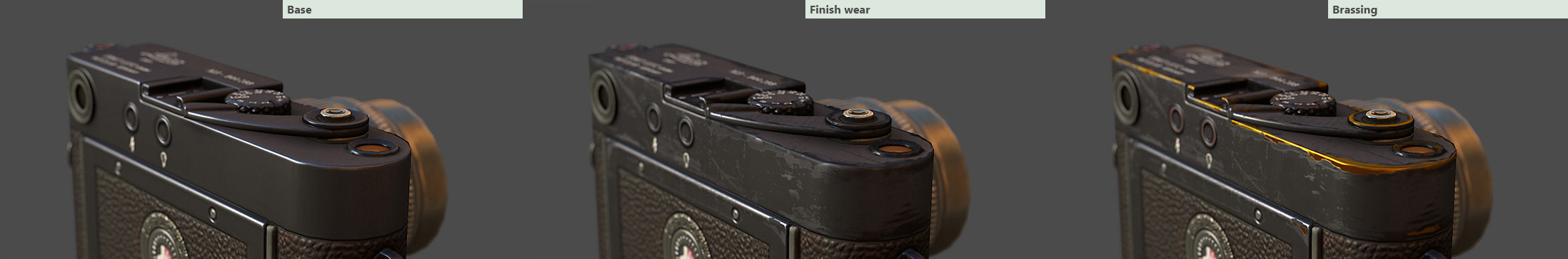
To get this sort of effect I use simple layer masks. I have a solid block of color (though, you could add an overlay as well for extra variation) for the finish wear, and then a layer mask that I paint in, or custom brushes/photo reference to get the desired look. This makes it really easy to simply copy the layer mask into the Specular and Gloss textures in my PSD whenever I make any changes to the wear pattern.
Conclusion
The material values represented here are not meant to be an “absolute” guide to the specific colors you should choose. This article is more of a stroll through my personal process when it comes to material creation. You may end up with a completely different result. So try to remember how all of the texture maps work together to complete a dynamic material. Use logic, reference, and judgement to pick values that suit your project!