Introduction to The Vertex Guild
Hey! My name is Ivan Carvalho, and I’m the founder and art director at The Vertex Guild, a AAA 3D External Development studio based in Lisbon, Portugal. This breakdown will focus on how we use Marmoset Toolbag to render and present 3D assets as a studio.
Let me start by saying that the lighting and rendering stages can make or break an asset, but they won’t save a bad asset if your fundamentals are off. Accurate material definition and a well-made mesh with good bakes (Toolbag’s baker is the way to go here) are necessary.
You can’t save a bad asset with amazing lighting & rendering, but you can break a good asset with terrible lighting and rendering.

The Vertex Guild Aesthetic
At the studio, we enjoy a specific aesthetic and aim to maintain continuity across all our assets.
We like creating old objects with lots of character, and to make that the primary focus of our shots, we opt for a more natural approach in terms of lighting and composition. The same goes for extra objects in the final composition; we avoid adding anything distracting from our primary focal point.
Overall, we aim to achieve a laboratory, archival look for our portfolio, so neutral colors are an obvious choice for the background, albedo, and light colors. Having a clear idea of what we want our result to be when considering the amount/complexity of the light setup is important to achieving believability. As always, the key to having a clear vision is a lot of references.
Asset Import & Animation Setup
In-house, we use the FBX format to export meshes. Since we’re not dealing with proprietary engines or anything of the sort, FBX provides the most versatility and simplicity. We only need a mesh, material slots, and the ability to import baked animations from our 3D software of choice, 3ds Max.
For example, the animation for the R.A.C.E asset was made with keyframes in 3ds Max because it involved a lot of parenting. It was faster to achieve the result we were looking for, but you can achieve the same result using Toolbag’s built-in keyframe editor and animation system. We have done so previously with other assets and animate all of our cameras directly in Toolbag.
The asset seen below (KRYAPP 301) had all the mesh and camera animations made in Toolbag’s Timeline window. Here is a quick peek at what the timeline setup looks like.

For our camera animations, we usually keep it simple, just as you would if you were filming a B-roll with a real camera setup: camera pans and push-ins are our main go-to’s for camera movement. While importing scene objects, make sure all your pivot points are where they should be and that the scale of your objects is correct. Failing to do this now may result in having to go back and fix it anyway, which could hinder the work already done inside Toolbag.
We also use a simple plane mesh for the ground with some tiling UVs to apply a simple material later.


Basic Scene Setup & Settings
Our basic scene usually contains the assets, the ground plane, cameras, and lights. In addition, we typically include a little AprilTag (the white square with the scale bar on it) to add flair and reinforce continuity across the assets. The scenes typically look something like this:


We aim to get our assets in Toolbag as early into production as possible, set it up for quick re-iteration, and start working on lighting and composition. We found that we would get better results if we set up the pipeline first and continued iterating with the context of our final application, which, in our case, is Toolbag.
Setting Up Scene Lighting
Most of the concepts discussed here are relative and vary from asset to asset, so don’t take them as gospel but rather as a general rule of thumb.
For starters, we have our asset, a floor and, by default, a Sky object. I’m skipping the texture import & setup part here as that is covered extensively elsewhere online.
Sky objects are included in every default Toolbag scene and are a fundamental part of the rendering process. At Vertex Guild, we use the Sky object not so much to light our object, but to introduce subtle and natural ambient reflections (no ambient light means our ambient reflections will be black or some other flat color). To do this, we lower the Brightness of the Sky until we get some ambient reflections that still need to light our subject meaningfully.

Rotate the Sky object to find angles with nice highlights and avoid objects looking flat. A good rule of thumb here is for the camera to stay on the shadow side, as it adds a small amount of drama to the shot for free. All that being said, do not underestimate the power of the Sky object to light your entire scene by itself or be the primary light source.
In our case, direct light makes more sense for the previously mentioned aesthetic. The logic behind that is that if you are taking pictures of a rare object or cataloging artifacts, you would use some large soft light over the object and maybe use a fill light since the primary goal of these photos would be to document the asset clearly, using a controlled lighting setting.
When going for this ‘’archival’’ aesthetic, we like to limit the number of lights to a small number, usually no more than 5. These include rim lights and a fill light if we need to fill in any overly dark shadows.
Cue the top light — the ruler of all lights. This light will get you 80% of the way there, 80% of the time. Move your light above your asset towards its front (or your main focal point) so it’s not directly above. Then, play with the light’s Diameter slider until the edge of the shadows looks natural and not overly sharp.

Woodworking Tools #3 – Sky Light + Top Light
The screenshot above shows the Sky light and the top light. The top light is the primary light source in many of our renders, excluding some more stylized or dramatic renders. The Light Type can be set to whatever you prefer, although we use a lot of Spot lights for the more directional ones, and a combination of Spot and Omni lights for rim lights and other secondary lights. More on rim lights below.
Rim lights highlight the contour of the object we are presenting to separate it from the background. In most cases, we use two rim lights: one for the far side of the object, and one for the closest face or left and right. In some cases, the rim light can be used to accentuate the material’s roughness and not necessarily to outline the object’s silhouette.

Woodworking Tools #3 – Sky Light + Top Light + Rim Light
Last but not least, the fill light. The secret is in the name, as usual. The purpose of this light is to fill in any shadow areas deemed too dark. Usually, this light is directed at the object roughly the same way the camera is to fill in these overly dark portions of our object.

Woodworking Tools #3 – Sky Light + Top Light + Rim Light + Fill Light
When using fill lights, be careful not to introduce unwanted shadows. The Diameter slider, coupled with the Brightness slider, should provide enough control to lighten problem areas and keep unwanted shadows in check.
Again, all of these are asset-dependent, and the less conventional the composition, the less likely you are to stick to this basic lighting setup, so go ahead and experiment with different light sources, their position, and intensity to achieve your desired result.
Ray Traced Render Setup
When it comes to render settings, enabling Ray Tracing in the Render object is the most obvious way forward. We use ray tracing in all our renders as it looks better than raster renders. Toolbag makes this as easy as enabling ray tracing with a click of a button, and we’re good to go.

Right under this, we have a Bounces parameter, which determines the number of times a light ray can bounce on a surface until it stops existing. Circling back to when I said if the image has too much noise, we can adjust the number of bounces. These are the bounces I was referring to—the more bounces, the less noise. This can impact performance, so proceed with caution.
Another render setting of importance is Transmission. This is the same as the Bounces setting but pertains to light bounces on materials with transmissive properties. We usually leave the Shadow settings at their default values except for the Shadow Quality, which we set to Mega.
One slider I would like to mention that is a bit exotic is the Shadow Offset parameter. This can be helpful when you have some misbehaving shadows. One edge case we encountered is that sometimes your shadows seem to project directly on the mesh, ignoring normal map information. The Shadow Offset parameter helps alleviate that in these types of cases. Here is an example:
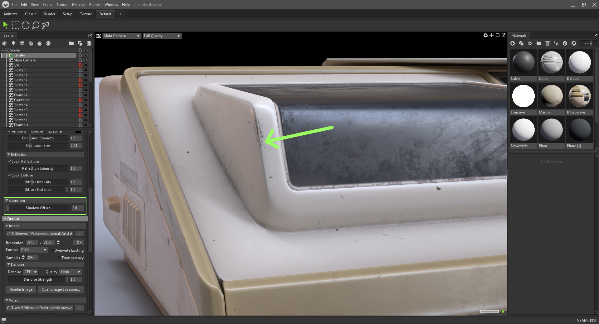
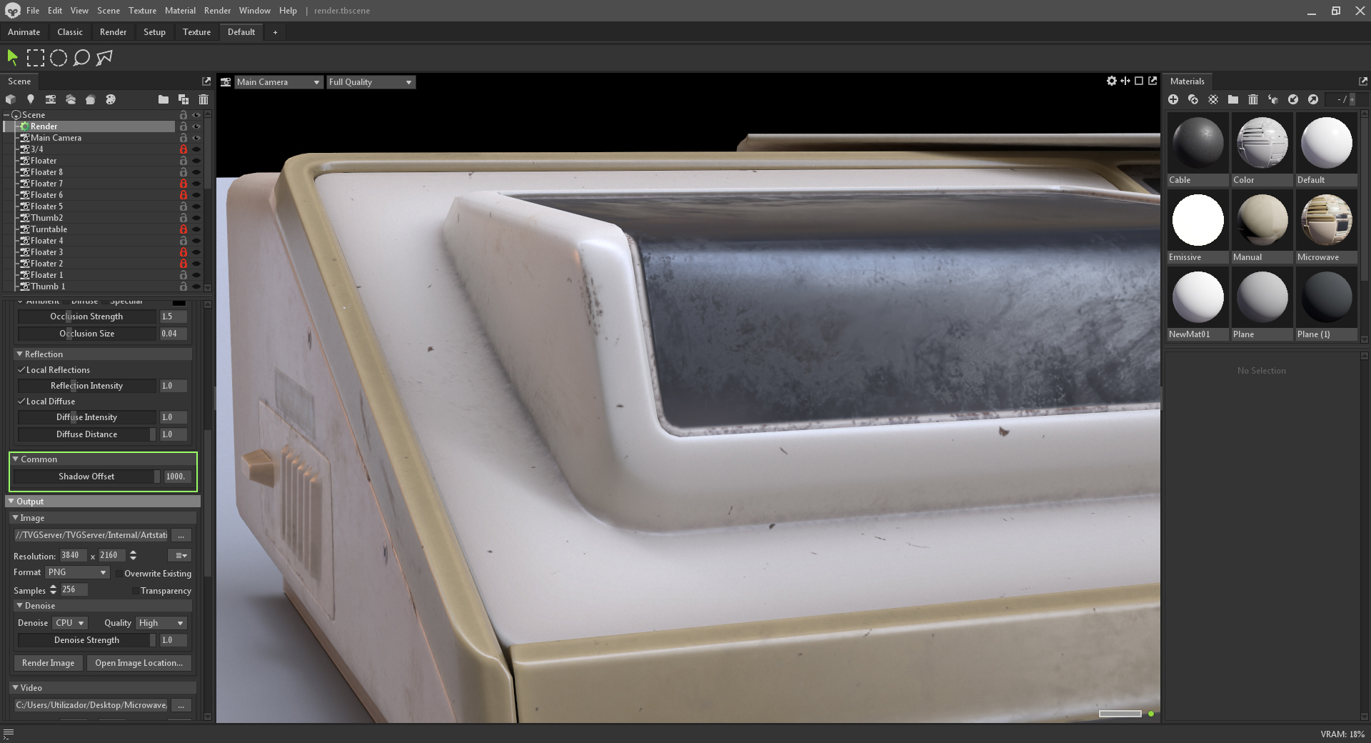
The image above on the left shows Shadow Offset set to 0. Some areas with hard shadows look like the light is being rendered on the low-poly object, ignoring the normal map. The second image has Shadow Offset set to 1, and the problem areas are improved.
A brief note on Denoise: We don’t use it, ever. We believe the smoothing incurred during the denoising process results in less natural-looking images, and in fact, we more often than not introduce additional noise into the render to add believability. If your image has unacceptable noise levels, we can mitigate that with more light or Bounces in the Render object settings. With that said, the last step is to turn off all denoisers—Viewport, Image, and Video. That should cover most of the render settings we use regularly.
Tone Mapping & Camera Settings
Tone Mapping is a defining factor in an image’s final look. Our favorite Tone Mapping mode in Toolbag is ACES, which gives you a very nice range of punchy colors. However, it can be too contrasty by default, especially if you don’t set it up before starting your first lighting pass.
This is why it’s smart to get your asset into Toolbag as early as possible. This way, you can set up your scene and remember that context while texturing your asset. In any case, the Tone Mapping’s Exposure setting should be used with their lighting counterparts to achieve “correct” exposure and not as an afterthought “on top” of the lighting work.
Below are a few comparison renders between some of Toolbag’s different Tone Mapping modes.

Next on the list of must-tweaks is the Depth of Field. In Toolbag, this parameter lives in the Camera object. It heavily relates to another very important camera setting – the Focal Length (Field of View in Toolbag).
Focal length can be thought of as the zoom level on our camera. Lower focal length equates to less zoom and more perspective. Conversely, higher focal length translates to more zoom and less perspective.
We try to use focal lengths corresponding to real-life lenses, so we stick to 35mm, 50mm, 85mm, 120mm, and rarely 200mm for a crazy closeup. Most shots are taken at 85mm, as that’s our favorite look. We feel this allows us to see more of the asset, as the perspective distortion can lead to some portions of the asset not being readable. Below are some images for comparison between the different focal lengths:
Another effect of focal length in real-life photography is the amount of blur when working with depth of field. A focal length of 120mm will result in more blur, while a 35mm one will result in less blur. In Toolbag, the main contributor to the amount of blur you will get in a render is the Aperture setting – a lower Aperture will result in more blur, and a higher Aperture value will result in less blur.
Check out our quick guide on How to Use Depth of Field in Toolbag
Whenever we try to capture a still image of our target, we usually frame it in the center of the shot but try to angle the camera so it never looks at the target at a perfectly flat angle. This could be a three-quarter angle, a front shot with the camera tilting down, or viewing the asset from below to make it feel more epic. Tried-and-true composition concepts apply here; the rule of thirds, symmetry, hierarchical shape distribution, etc., should be considered. We also like to take close-up shots of interesting areas of the asset to show off how much detail there is. This would otherwise be missed from shots featuring the whole object or scene.
Our assets tend to have many images per post, which can get tedious, so we add at least one video (or any other moving piece of media) per two still images. This way, you get two static images, one video, a couple of closeup stills, another little video, and so on. In our experience, this makes the presentation more appealing overall and allows you to get more creative with the aesthetics since the videos are just little pockets of detail meant to break up monotony.
Closing Thoughts
Hopefully, this outlines most of our process and thinking when rendering assets in Marmoset Toolbag. We hope you can walk away with something useful from this breakdown, but remember to experiment with different setups and explore other checkboxes and sliders we didn’t mention here. What works for us might not work for you, and that’s okay.
If you want to check out more of our artwork, you can find us on Artstation.
We would like to thank Ivan Carvalho for writing this breakdown. You can find more of The Vertex Guild’s work on Artstation and create professional-quality renders using the free 30-day trial of Toolbag.
If you’re interested in collaborating on a tutorial or breakdown article, please send us your pitch and a link to your artwork to submissions@marmoset.co.