Introduction
Hi! My name is Juras Rodionovas, and I’m currently a Junior Character Artist at Avalanche Studios based in Stockholm, Sweden. I’ve been part of the character art team for the past 6 months working on the upcoming Rage 2.
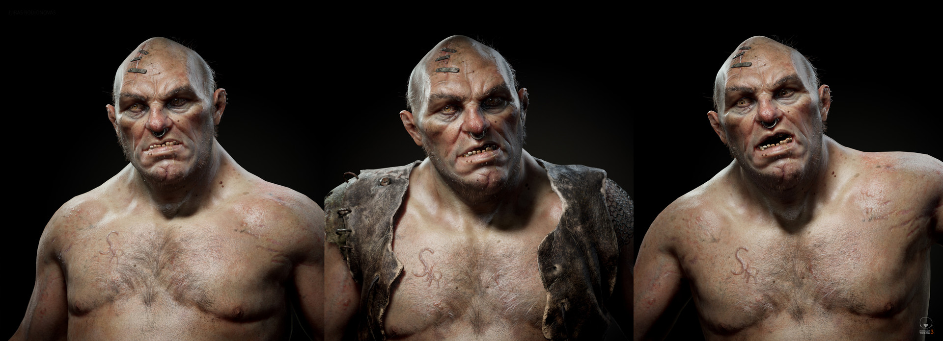
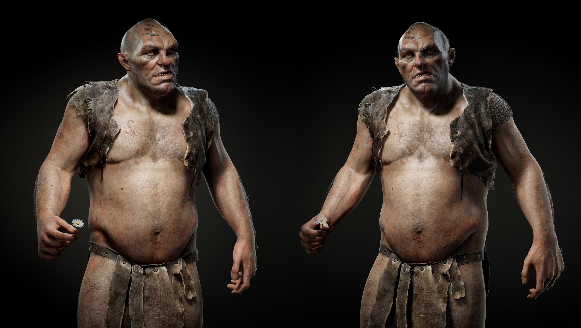
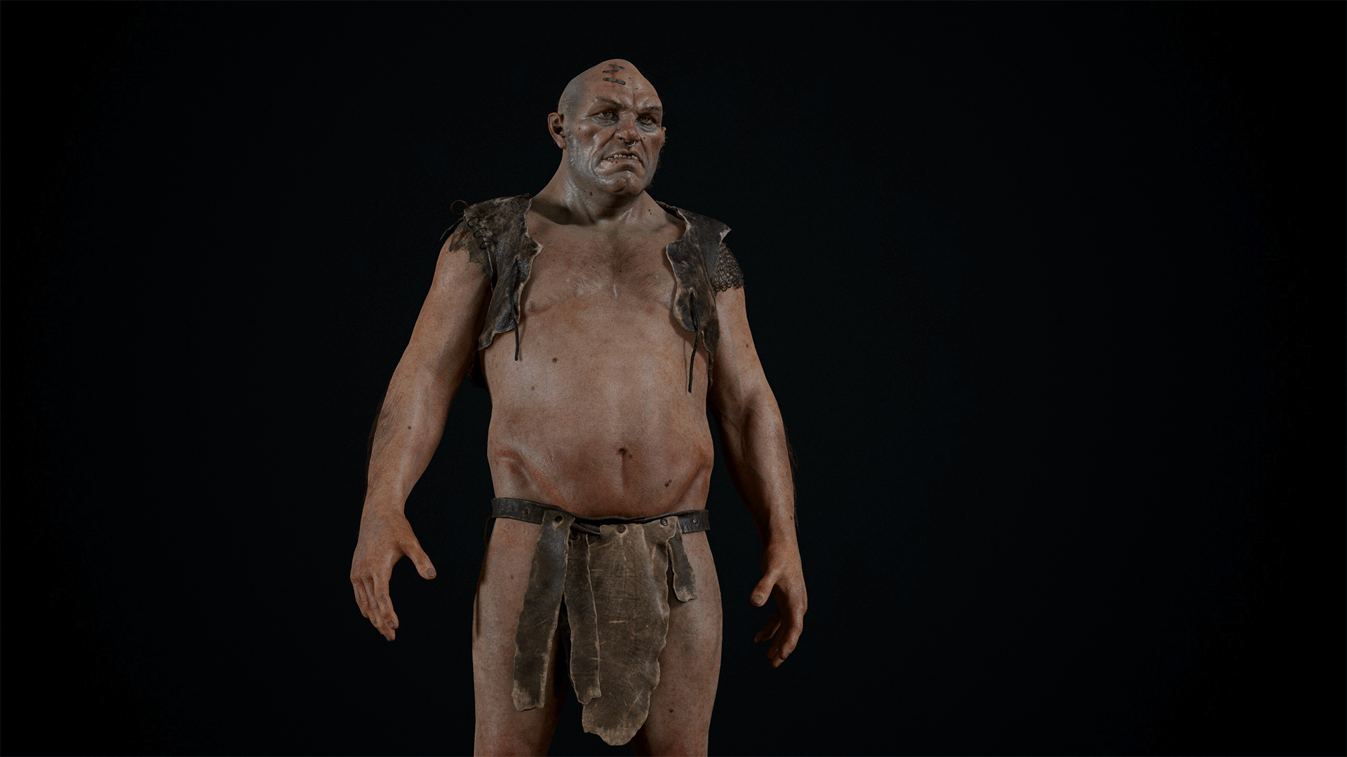
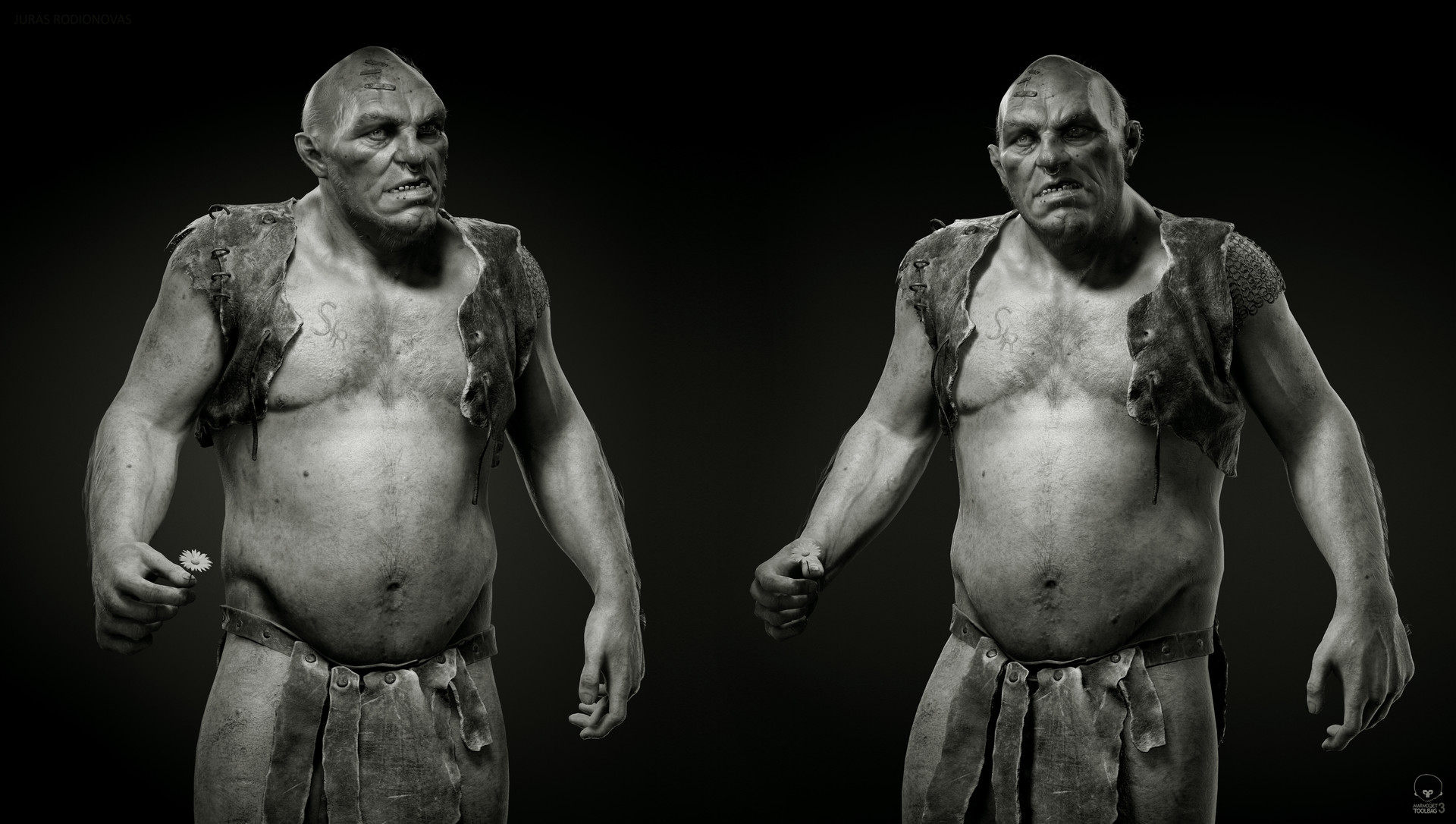
In this article, I will cover how I use Toolbag’s lighting system to create storytelling elements for my characters. For demonstration purposes, I will be using one of my previous characters, “George The Ogre”, as an example throughout this article.
Light Fills The Canvas
Before I begin describing specific examples, I want to briefly explain my philosophy when it comes to my lighting approach and how it helps me create a loose framework when presenting a character.
I strongly believe that lighting is one of the most important aspects when it comes to telling a visual story, whether you’re presenting a prop, environment, or a character. While there are solid examples of good lighting setups for characters that can be used for multiple scenarios (3 point, Rembrandt, Butterfly Lighting, and many more), I personally try to avoid using them as strict guides. They’re good starting points, however, I believe that relying on specific setups too much limits your ability to explore lighting creatively. It limits your understanding of form, color, and composition, which are the important components of storytelling and presentation. I always try to make my lighting fit the character, and not the other way around.
The way I like to approach it is to look at the character as a blank canvas. Even if I spent countless hours sculpting, modeling, texturing and setting up materials, the character will remain an empty canvas until it’s presented properly. Sky Presets, Point Lights, Spot Lights, and Directional Lights are like brushes to me. They are the tools that I paint my canvas with to extract my hard work and reveal the character that I have crafted.
At times, lighting in real-time can be quite technical. Toolbag, however, is incredible in its simplicity, without the overwhelming technical options that can be found in game engines. If you have a solid foundation in the fundamentals of art, you will have a much easier time achieving good results. That’s why I strongly recommend practicing composition, values, color theory, and form, as it will benefit your work a lot. Moreover, practicing these skills can help improve you in other areas as well.
Preparing The Canvas For George
When I’m creating a character, I believe it’s important to have a story in mind and a clear vision of where it comes from. This makes presentation much easier down the line and helps me ground the character in its own story.
When I created George, I had in mind that he was the vulnerable type. He didn’t have the best childhood nor life, but he learned to survive and found a lot of joy in the simple things, especially in nature. Having this backstory gave me a great starting point when it came to designing and executing the model. It helped with setting the mood and the direction of my lighting. I knew I wanted to make my presentation feel more illustrative than realistic, since George was more of a fantasy type of character.
Here are the main story points I kept in mind when it was time to present George:
- Since George enjoyed nature and spent most of his time living there, the lighting needed to have some warm tones. The warm lighting would emphasize his personality type – vulnerable, kind, and not actually scary.
- The face should speak volumes about George’s character. The unusual form of the skull and the various shapes of the face should be easy to read. I avoided having too many shadows on the face/head and tried to capture a lot of life with the eyes. This was facilitated by using a suitable HDRI image and having a key light placed to reveal at least one of the eyes.
- Aiming for illustrative lighting meant that some colors would have to be pushed, and perhaps include some sharp rim lights. Adding a visible falloff gradient on the key light would emphasize the composition and guide the eyes of the viewer towards the torso and head in the full body shots.
Finally, I gathered some reference to base my vision on before starting to work on my presentation.
Painting The Ogre
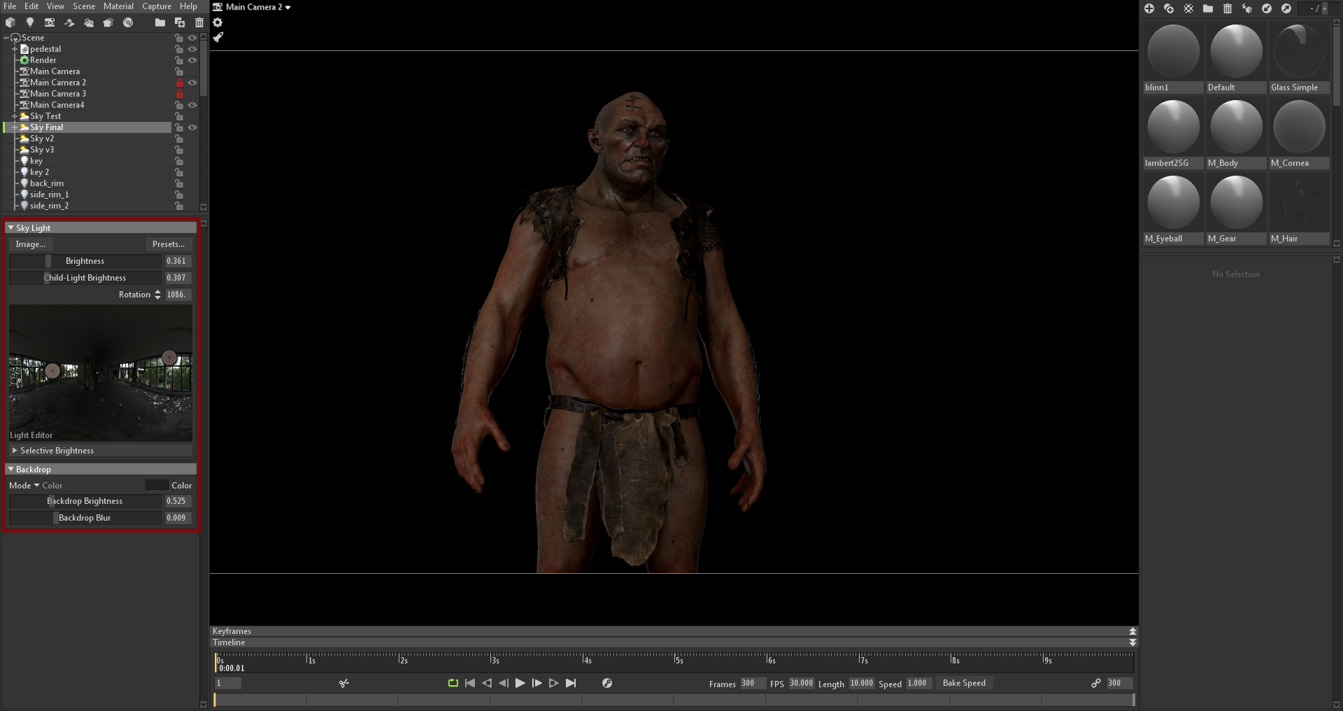
I usually start my scene setup in Toolbag during the texturing phase. I add some basic lights and use fairly neutral Sky Presets (HDRI’s) in order to get the colors of the textures to be realistic. It’s important to not have the colors be oversaturated, too dark, or too bright before tackling the final lighting setup. This is because the color of the lights will drastically affect the textures and overall saturation of the character. Knowing the principles of PBR texturing and color theory (how warm or cool lights will affect the base colors of your textures) will go a long way in helping you achieve the look you want.
Once I’ve established a solid base for my textures, I start tackling the final presentation. This is where I break my process down into more specific, iterative steps. The gif above shows how I tried to find a Sky Preset that fit my needs and gave me a base to start with. I treated it as a fill light in order to avoid having pitch black shadows. Sometimes, I go back to this step after I’ve added lights to the scene to create different versions. In the end, I chose to go with the Smashed Windows Preset, which leaned towards the neutral side of the spectrum and gave me a lot of room to play with the colors of the lights. It also gave me a really good reflection in the eyes, which is always important to me. Eyes that don’t have any environment or lights reflected tend to make characters look dead.
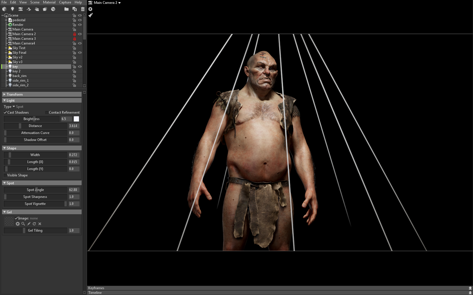
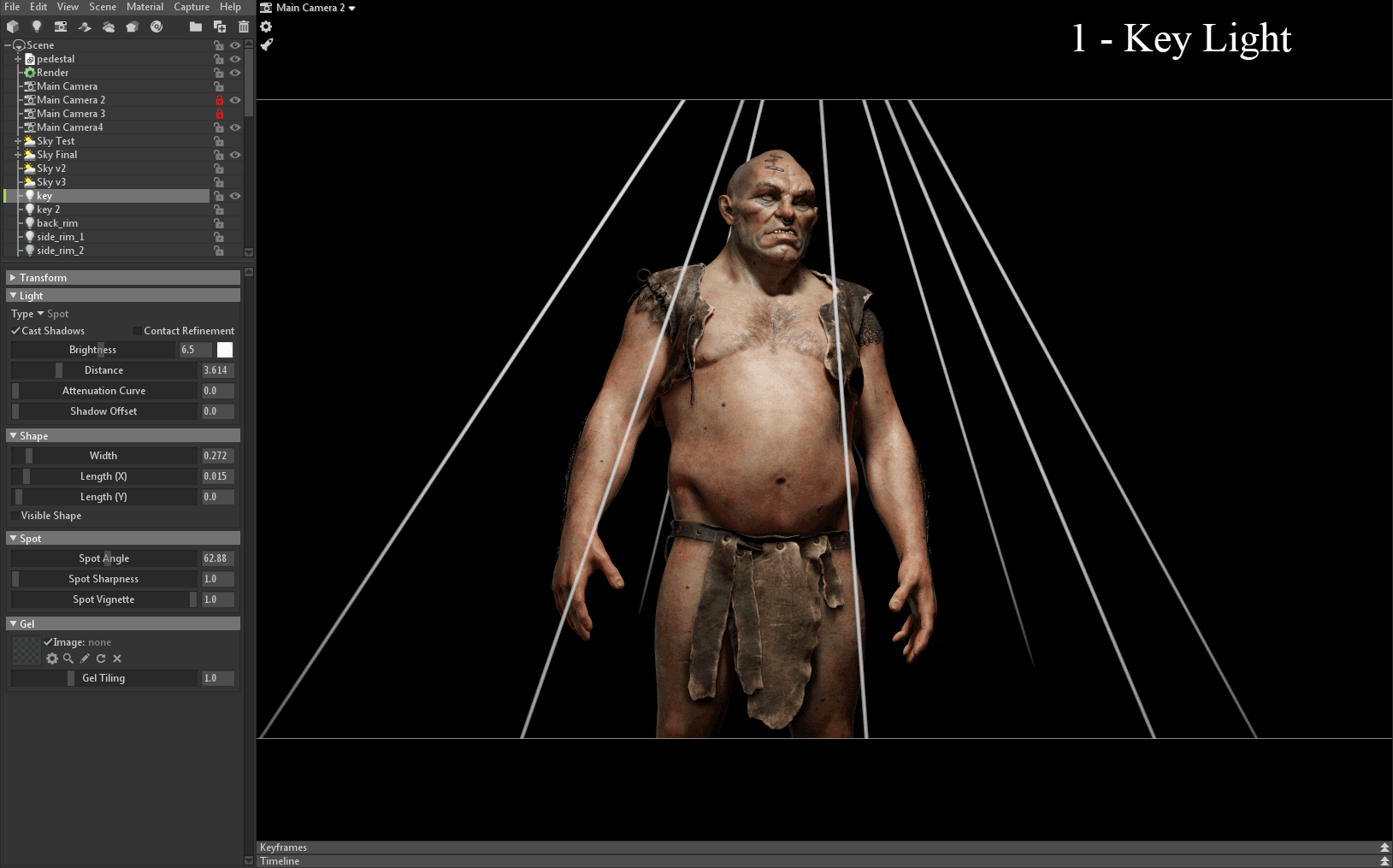
After I’ve established my Sky Preset, I started working with the key light. For me, this is probably the most important light in the scene and the one I spend most of my time iterating. I treat this light as the broadest stroke on my canvas – the direction, color, and size of this light changes 90% of the lighting. With this light, I focus on getting the right color and shadows, as well as bringing out the forms of my character. I tend to zoom in more towards the face when working with this light.
In this case, I set the Distance slider for the light to a low value. This creates a light-to-dark gradient, where the brightest area of the character starts from the top and dims down towards the legs. I usually prefer to use a Spot Light as my key light, because it gives me the most control. Though at times, I’ll use a Directional Light for a key light. It simply depends on my needs and what kind of presentation I want to achieve.
The Width and color of this light are very important. Cooler lights will desaturate the textures and bring a more neutral, yet chilling mood. For example, having cold lights can work when a character is in an evening, rainy, or creepy environment. Having a warm light will bring out the colors of the character and make the overall mood warm, safe, and happy. There are scenarios where you would want to mix both cold and warm lights to create specific, creative moods.
Increasing the Width or Length of the light will drastically change how soft the shadows are as well as the specular reflection on the forms (I will go into detail about this later on).
Since I imagined George to be living in some sort of medieval countryside, I didn’t want to make his personality feel scary. This lead me to choose a warm mood. An important thing to keep in mind is that making the lighting feel warm/cold isn’t simply about setting the key light to an orange or blue color. It comes down to very subtle shifts in color values and will depend on how the rest of the scene is set up. HDRI’s, tone mapping and post processing can shift the colors, too. In my case, the key light I used was leaning towards the blue hue, since my Tone Mapping and Sky Preset were warm.
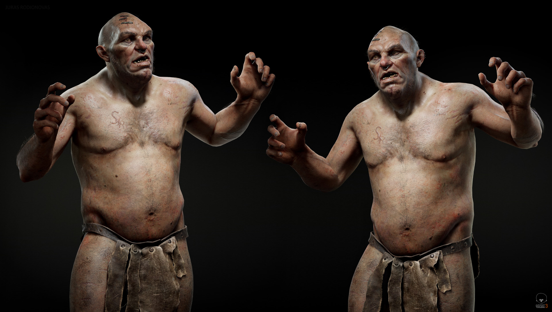
Once I felt happy with my key light and achieved the mood I wanted, I added the icing on top – rim lights (2, 3, 4). Rim lights are great for adding extra appeal to a lighting setup. It can help emphasize the silhouette of the character and make it pop from the background. They can bring some slight color variation in the lighting which helps make it look more realistic. Similar to creating realistic textures, you want to apply the hue and saturation variation to lighting as well. In this case, I put extra effort into making sure that my main rim lights emphasized the forms on the head that I sculpted. The skull structure, loose fat, and strong brow forms are a big part of the ogre’s character and tell a story about his past. In my eyes, it was important to make sure these features read very well to the viewer.
When it comes to color choices, it can be both functional and artistic. For example, I chose to have one of the rim lights set to a bluish color to represent light coming from the sky. It works well artistically too, because it compliments the warm key light and the other rim light.
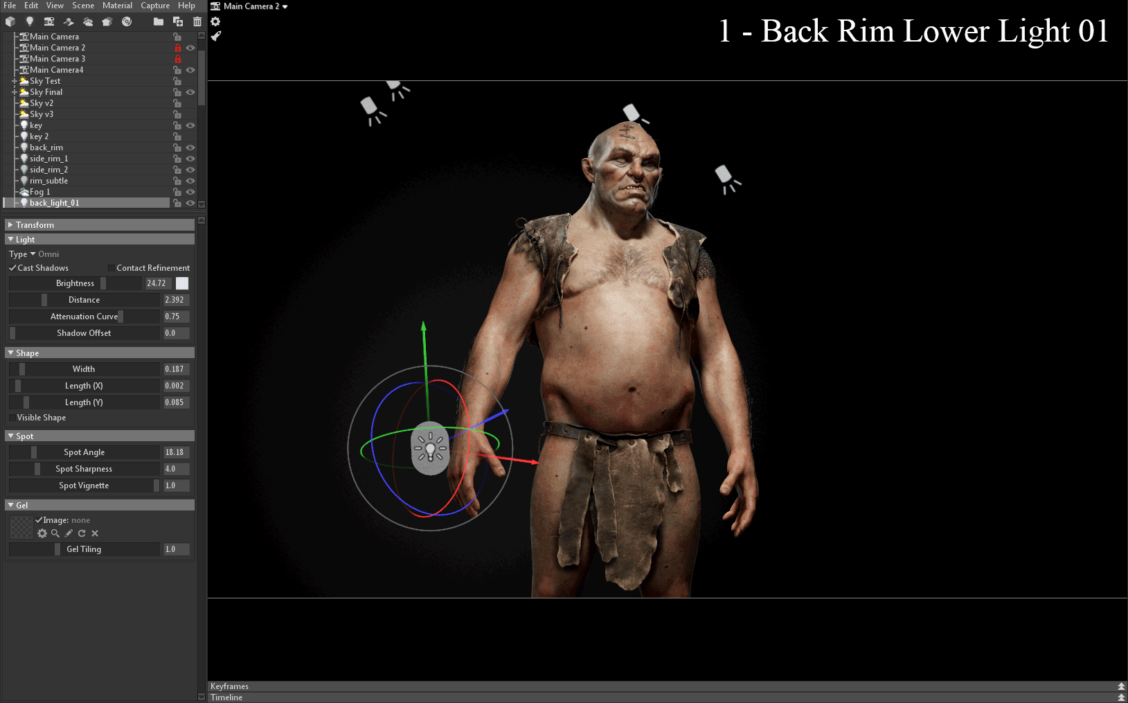
As a final touch, I added some Omni Lights to act as rim lights behind the character (1, 2). When used with Fog, they create a nice volumetric effect that can push the presentation even more. I tend to play with the Width of these lights (2) to get the right amount of coverage on the rim effect and bring everything together.
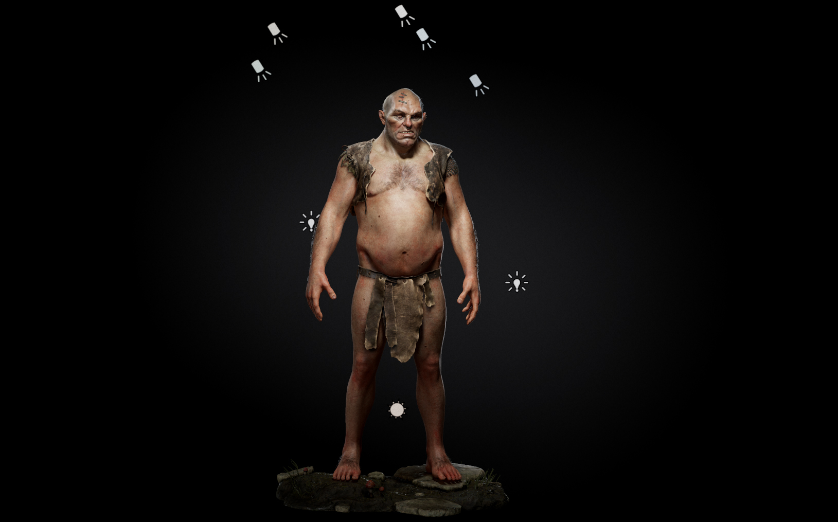
With the final lighting, you can see the character has a slight gradient which draws the eyes towards the face. The warmer mood and color variation in the top rim lights bring out certain features of the head. Lastly, the lower rim lights and volumetric lighting help push the depth and emphasize the fantasy mood. Each light has a purpose, and I believe it’s important not to overcomplicate the process, or else it can get muddy and unappealing.
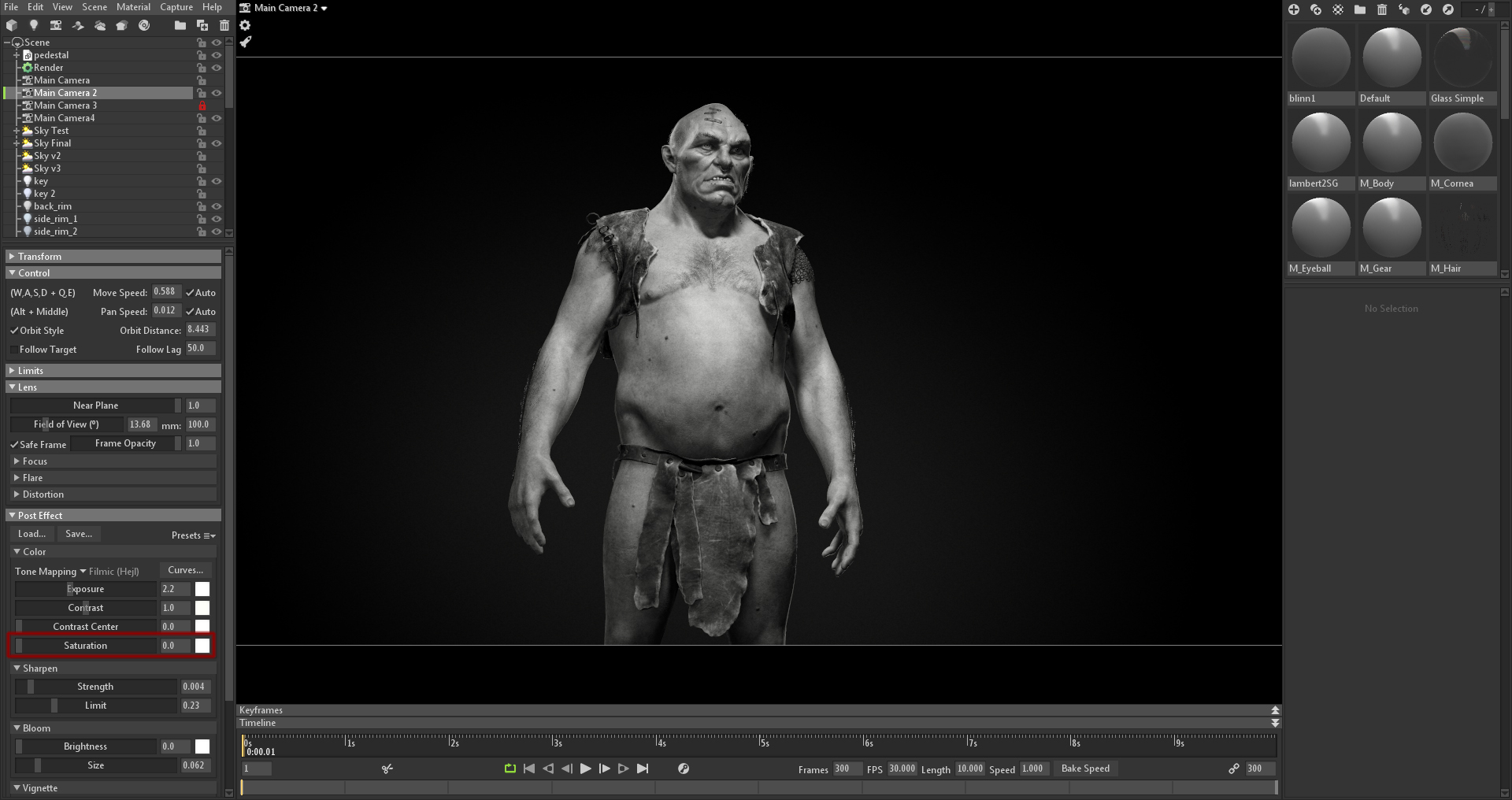
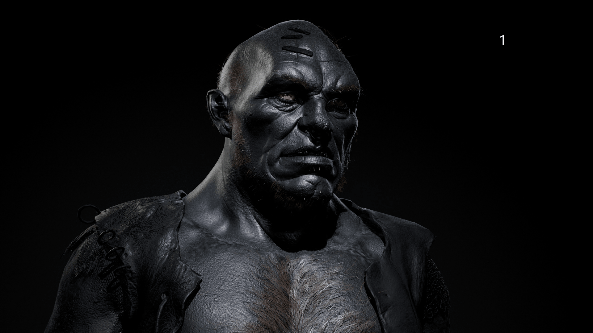
A good way to get a different perspective on your lighting is to select the Camera and set the Saturation to 0 in the Post Effect settings. This will force you to evaluate the values in your scene and avoid being distracted by color.
This helps me a lot when trying to push contrast in certain areas and helps make sure that everything feels balanced. It can also help when working with texturing and setting up materials.
Direction And Size Of Lights
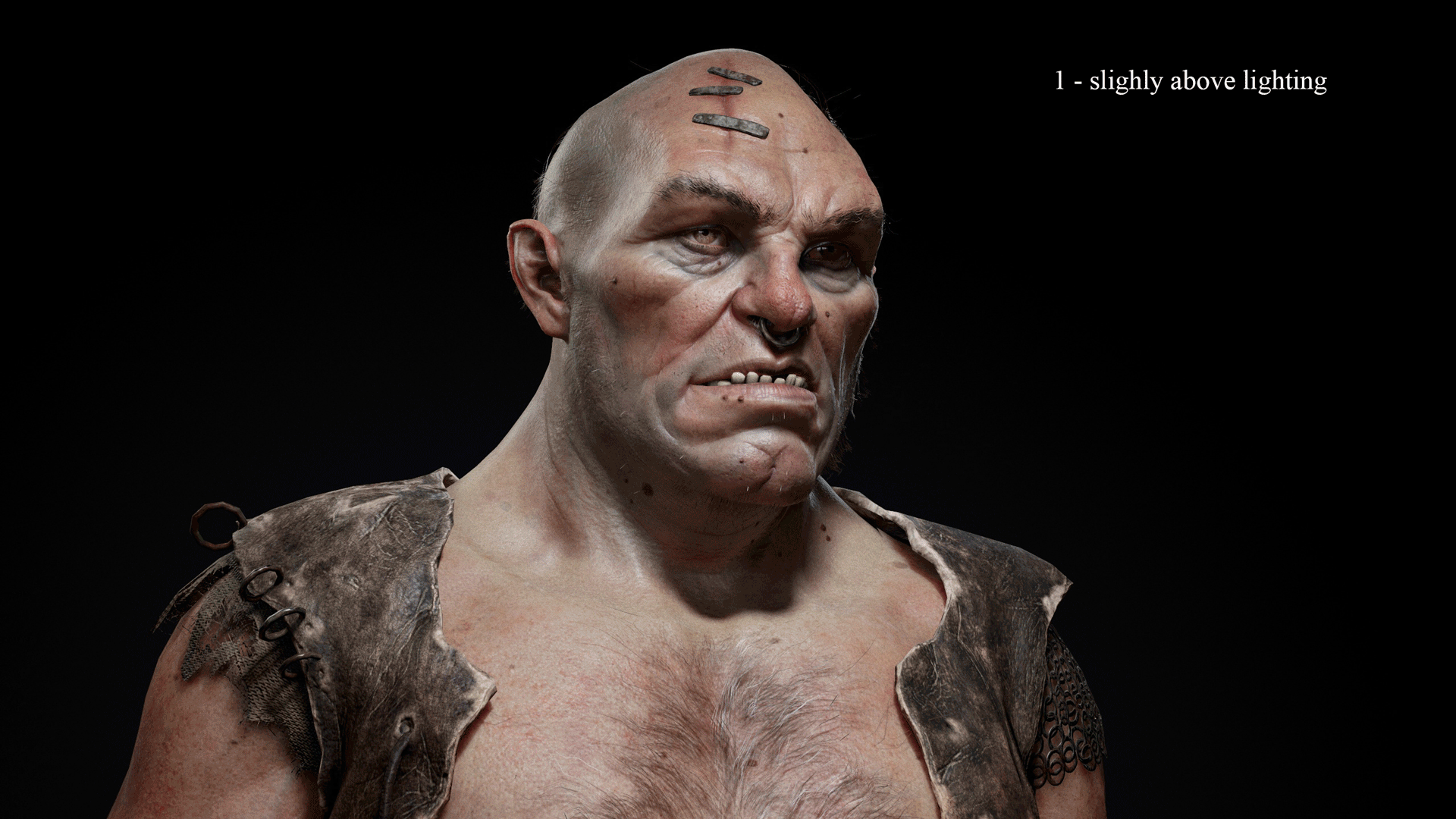
The direction of the light impacts how shadows are cast and how form is perceived. It can change the mood and the feeling of the character dramatically. For example, having the light slightly more overhead (1) will cast shadows without covering the eyes completely, leaving the viewer with enough visual information to be able to perceive the character’s facial features. However, having the light placed very high up (2) will create a big cast shadow that will cover the eyes, making the character look scary and mysterious. Bringing the light lower where it’s in line of the eye sight (3) will flatten out forms due to a lack of shadows, but makes the character feel very neutral and familiar, similar to how we see people in our daily lives.
I tend to use the shadows under the nose and the eyebrows as reference points, since they give a good indication of how high up the key light is placed and what direction it’s coming from in relation to the whole character.
The Width of the light plays a big role in how soft the shadows are and how tight the specular reflections become. Having a smaller Light Size (1) will create harsher cast shadows and make the specular reflection tighter. While increasing the Width of the Light (2) creates softer shadows and the specular reflections become broader, changing how the form is perceived.
I believe that changing the Width of a light can be used to your advantage if you’re going for a specific presentation style or when you’re lighting a certain type of character. When presenting a realistic character, you would want to match the Width of the light with the actual light source that the character is being lit by (sun, light bulb, flashlight, etc.), and you can do so creatively as well. I chose soft lighting, as I felt it matched my type of character better and worked well with the illustrative presentation I was going for. I didn’t exaggerate too much, since having bigger lights will make you lose smaller details on the model.
Conclusion And Final Tips
As I mentioned in the beginning, I believe that lighting is crucial when presenting your work. If executed well, good lighting can make a night and day difference and bring out the story of a character in many ways. Marmoset Toolbag makes the process a lot less technical, which helps me focus on the artistic part of presenting my work.
Before I wrap up the article, here are some general personal tips that have helped my ability to create good lighting setups:
- I gather reference from movies, photography with good lighting, and cinematography. I occasionally study photography and research how photographers work. They know how to make incredible pictures, and their way of working with lights and cameras is applied similarly to the tools found in various rendering engines, including Toolbag.
- Lighting can be technical, but very artistic. Make sure you have a good foundation in art fundamentals. Mastering the basics is crucial when working with any type of art and it has improved my work immensely.
- I’m not afraid to scrap my lighting when I feel it doesn’t work well. Iteration is key, and I personally never achieve the lighting I want on the first attempt.
- I make sure each light has a purpose. It can become very hard to work when the scene is flooded with many different lights. Less is more.
- I always make sure to have some sort of story and mood in mind. It gives me a good starting point and some direction for presenting my work.
A big thanks to those who took the time to read my article! I hope that it was insightful and that my approach to this topic can help someone out there to improve their work. A huge thanks to the Marmoset team as well for giving me the opportunity to write this article!
We’d like to thank Juras for writing this breakdown article. You can find more of Juras’ work on Artstation.
Paint your characters with light using Toolbag’s free 30 day trial. If you’re interested in collaborating on a tutorial or breakdown article, please send us your pitch, along with a link to your artwork, to submissions@marmoset.co.