Introduction
Hi everybody, my name is Walid Kaskhoussi Perrussel and I’m a self taught 3D artist. In this article, I’ll be giving an in-depth explanation of how I created the wood material and lighting for my Gothic Confessional scene using Marmoset Toolbag 3.
The Wood

Initially, the project was meant as a practice piece for ornate modeling and realistic rendering. To make the whole piece convincing, I knew that the wood needed to be the star of the show.

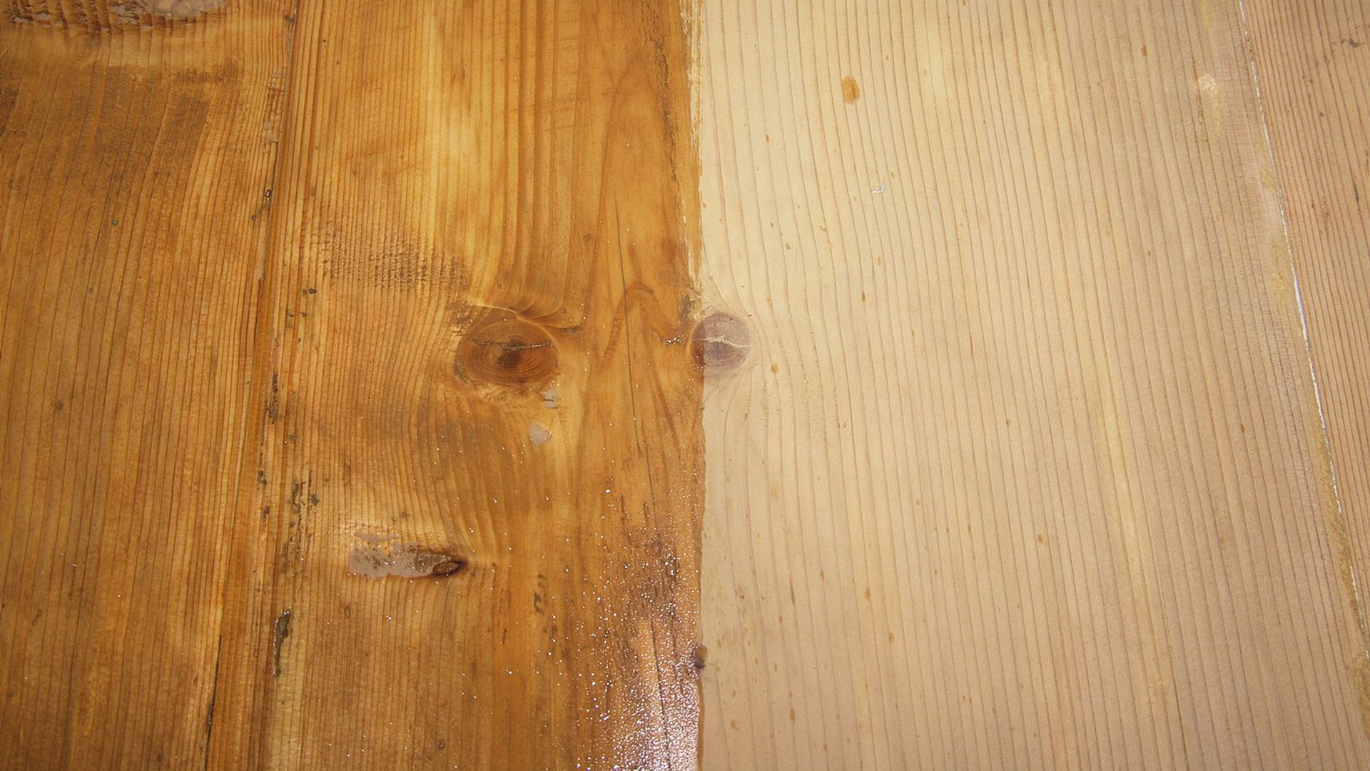
So how is it done? The type of wooden furniture often found in churches can be very old. Some areas don’t have the same thickness of varnish, some are polished, while others are wearing off. There’s also plain raw wood panels. These are the types of things our brain is used to seeing in such places, and it’s really good at spotting something that looks fake. The infamous “Something is wrong, but I can’t put my finger on it.”
Last but not least, to achieve realism, the wood grain has to be offset and go in multiple directions. Some complex pieces of church furniture can be composed of more than 300 wood pieces glued together. Using tri-planar projection here would have killed any realism.
Base Wood Workflow
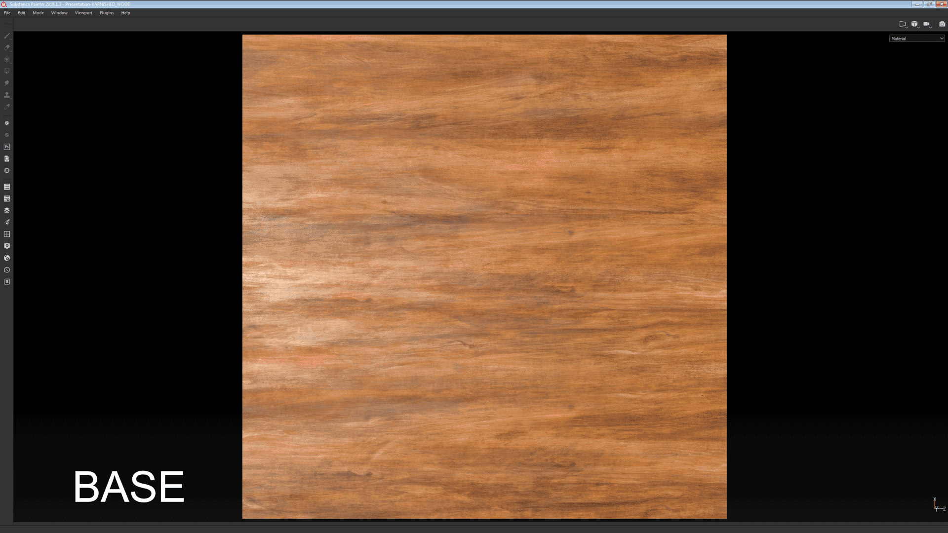
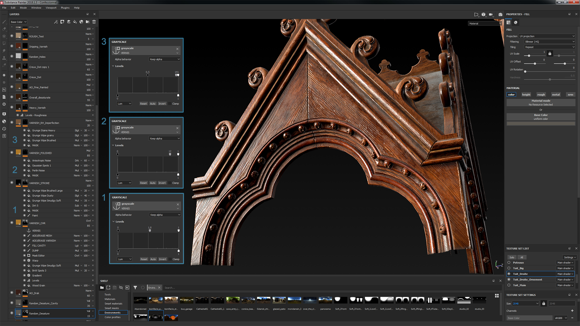
With the exception of the unvarnished roof and floor, all the pieces share almost the same base procedural raw wood material. (Image captured from Substance Painter viewport.)
The raw wood was built with the varnish in mind, meaning that some features were exaggerated to emphasize the burnt wood grain once it was under a layer of coating. The floor, roof and interior sections were less exaggerated.
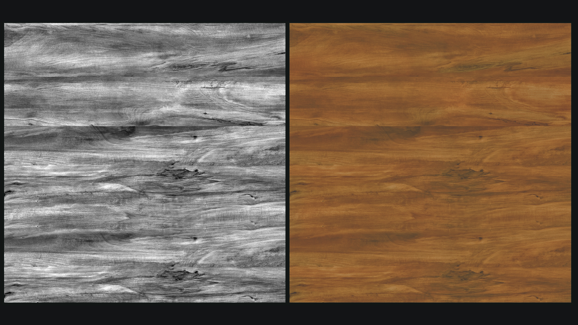
The most important map here was the albedo. It needed to be punchy and read well under the varnish. Initially, the base color of the material was a mix of grunge maps and masks. That set up was too time consuming. There were too many layers and masks to change if I wanted to tweak something. Instead, I replaced it with a wood texture I found on Textures.com and created a grayscale version for masking purposes.
With this setup, I can quickly make tint/hue/color variations and break up the tiling of the base color map.
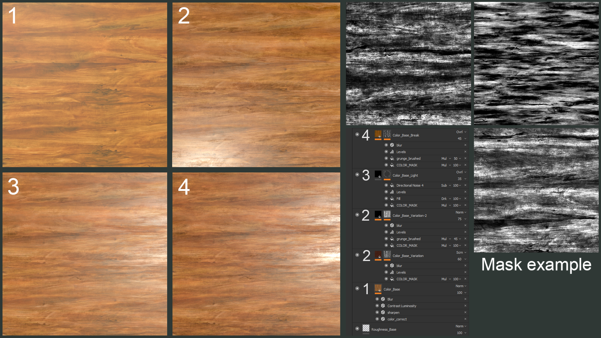
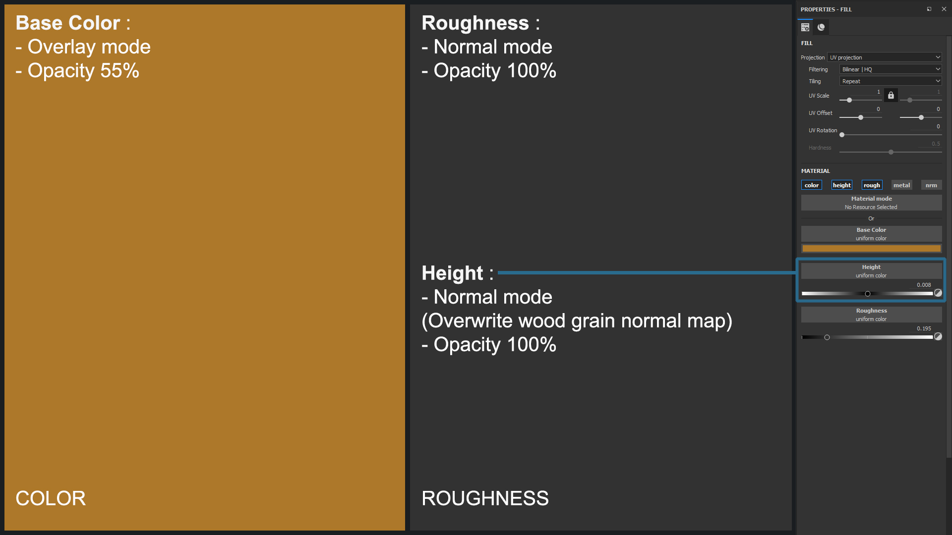
- Base color map. I used the Color Correction filter to change the overall tint/contrast. I also added Blur because I did not want any noise, only color information. The Sharpen filter is used to keep the main grain lines intact when blurred, otherwise they look smudged.
- Large scale variation. I made the first and second variation passes using the grayscale bitmap and a Levels adjustment. You can get a ton of variation with various tiling/offset settings in the texture parameters of Substance Painter.
- Medium scale variation. I used the same process as above.
- Another version of the large scale variation effect.
Once I had my base color map, it was time to add the wood grain. For this part, I wanted to keep as much control as possible. I imported a mask from Substance Designer, achieved with the help of the Wood Lath tutorial created by Joshua Lynch.
Having the wood grain embedded in the color map limits what you can do. Using a mask gives you the ability to offset and tile the Albedo, Height and Roughness maps independently.
Wood Grain color map. This effect was created with a Levels Adjustment and a Gradient Filter. When masked, it is very powerful.
I used the same process for the Roughness and Height maps, the latter being the most important because it drives the varnish generator.
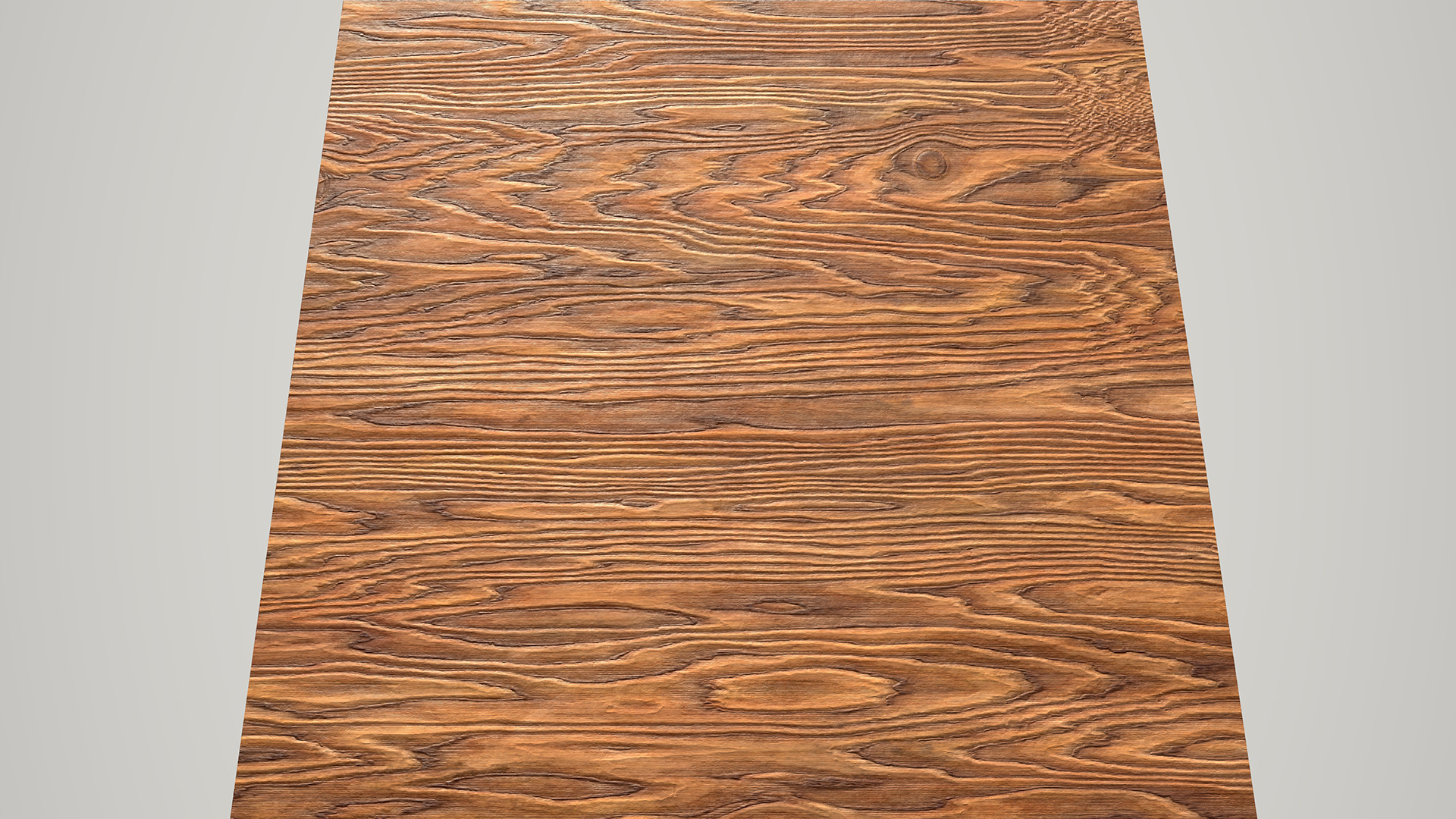 An Iray render of the raw wood including all channels (Color, Roughness, Height).
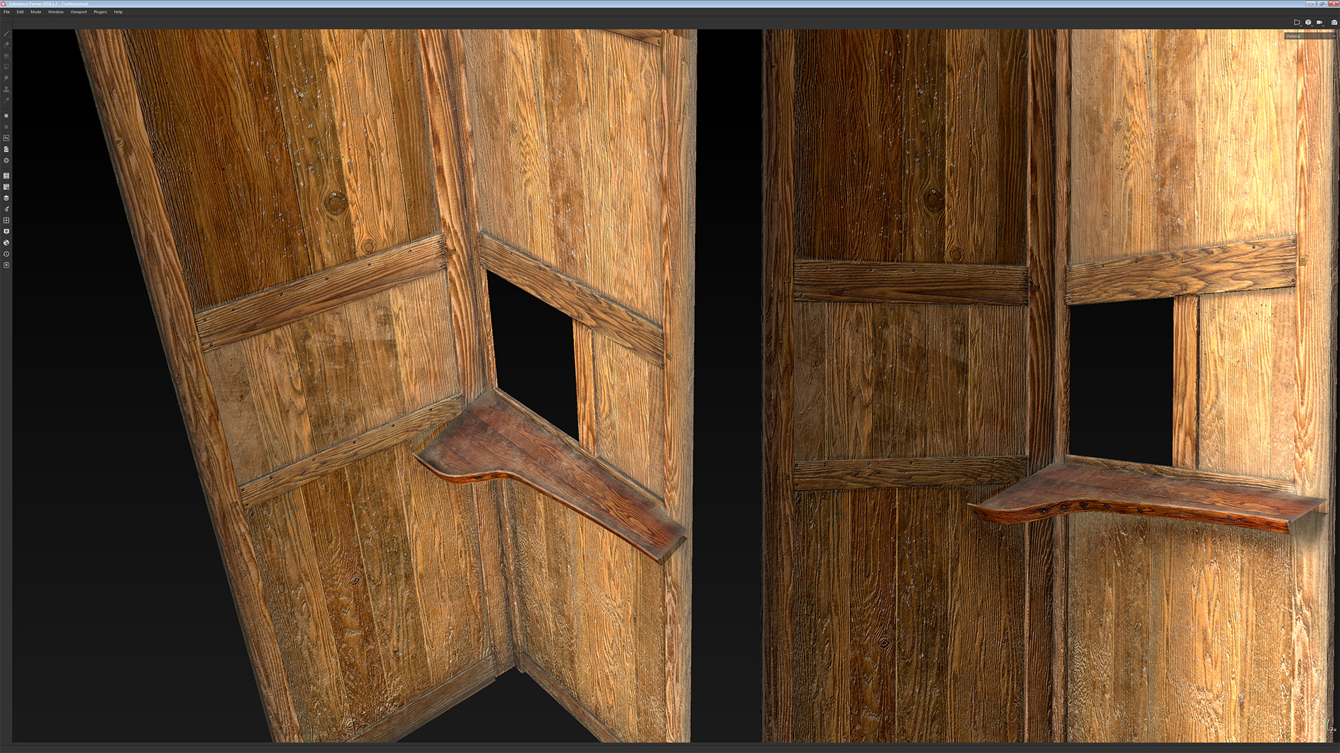
 Interior textures. The panel separation was achieved by using the Tiles generator and the Histogram scan nodes inside Substance Painter. The nails, damage and filler are Normal map details painted inside Substance Painter.
Note: If the mesh is going to be raw wood and you’re happy with the distribution of the wood grain, I would recommend rebaking the Normal/AO/Curvature maps. This way, you can apply fine dust into the cavity. I would advise keeping the original Curvature/AO maps for large edge work. For this, right click on the textures, hit Export Resource and re-import. If there is varnish applied, repeat the same process but at the very end.
Varnish Workflow
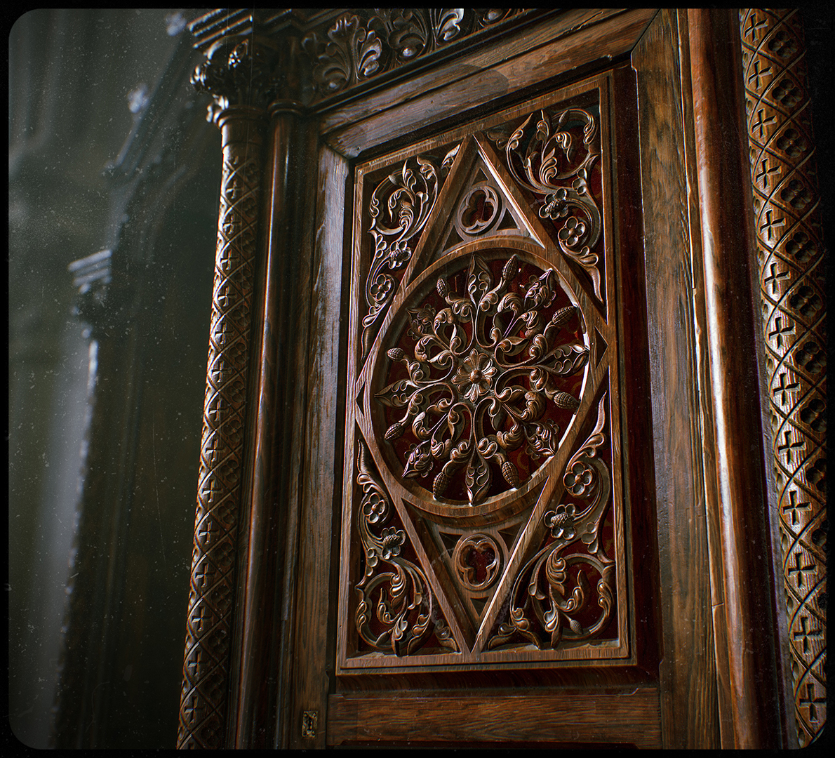
Varnish tends to follow the wood grain. Deeper cavities don’t get covered as much on the first brush pass as shallower areas do. This leads to the very specific roughness variation visible on this type of furniture, where deep cavities are rougher and levelled areas are smoother and glossier.
I tried a number of techniques before settling on painting a mask in Substance Painter for the varnish layer on top of a raw wood base. I used as much thickness variation as the grayscale slider could offer. Let’s dig in!
Material Creation
I decided to make use of the anchor point system inside Substance Painter to drive different effects based on the thickness of the varnish. Black being no varnish, and white being fully varnished and polished.
- First pass of Roughness and normal stroke detail
- Polished/fully varnished
- Brushed/imperfect Roughness and Normal detail. Adding variation to some parts of the polished surface.
Foundation of the Varnish Material Color/Rough/Height values.

You can see how the mask looks in the screenshot above. Each value corresponds to a specific anchor point mask.
The video demonstrates how each value interacts with the overall material and how the varnish gradually recovers the wood base completely.
The Lighting
Now it’s time to make the whole piece shine! I already knew what I wanted for the mood of the presentation since I started this project, a golden hour morning light with a dark blue/green ambience.
Thanks to the new Global Illumination and volumetric lighting introduced in Toolbag 3.04, I was able to achieve heavily occluded and soft, natural light coming through inside of the church.
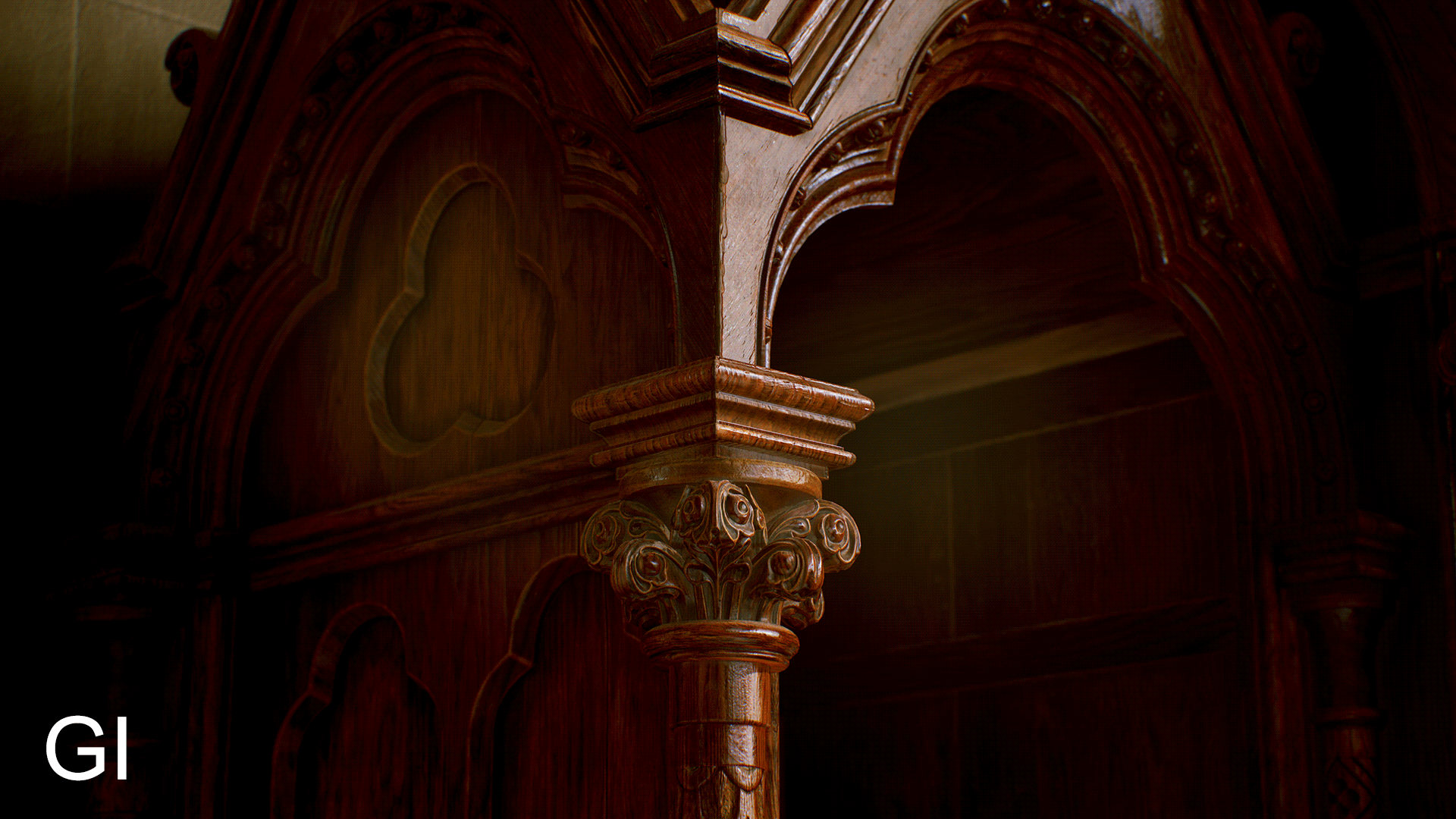
The Glory of GI
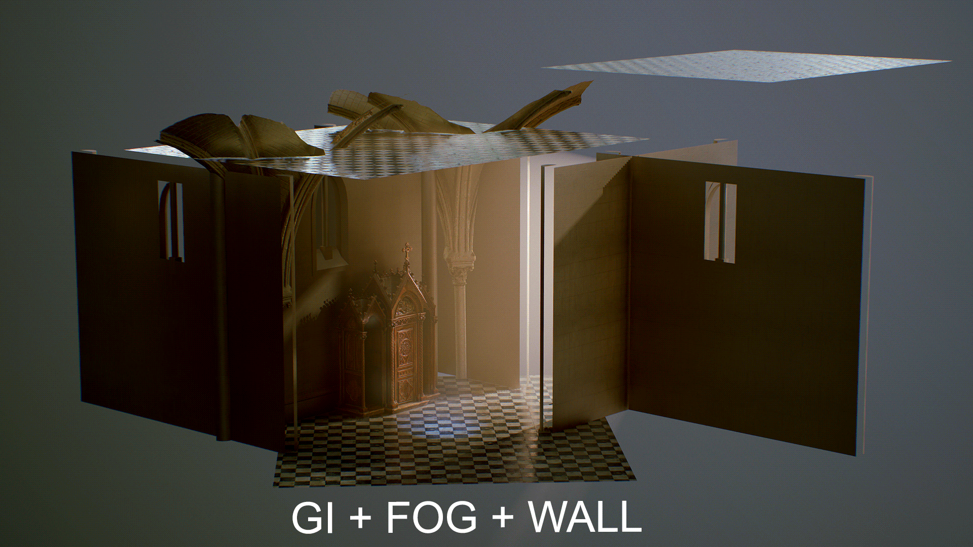 The full scene. Look at that beautiful, new age church. Notice how the volumetric light lifts the shadow areas.
Note: Use the Width slider of light parameters to adjust the sharpness of the shadows.
As you can see, the thing that had the most impact on the lighting and mood is the combination of Global Illumination and Fog. However, to make the GI shine, you have to give it a surface for the light to bounce and create occluded areas. In other words, some food for the sexy reflections. Churches are not open spaces, light has to first go through stained glass and arches around the church will further block the light in some areas.
This is why simply using a plane for the ground and a fancy church HDRI was not enough to recreate lighting that can be found in such a space. The best way to illustrate this is to show you the construction of the scene. It’s a simple blockout wall with a random (not even tiling) texture for the color bounce. These simple actions cause a big difference on the render.
Even though I find the three results interesting in their own ways, turning GI on gave me the closest result to what I wanted. I then manually added point lights with very low brightness and no casting shadows in the areas that were too heavily occluded.
Let’s take a closer look at one of the Global Illumination settings (which can be found in the Render object properties) called Voxel Scene Fit. This setting can dramatically affect the reflection and occlusion.
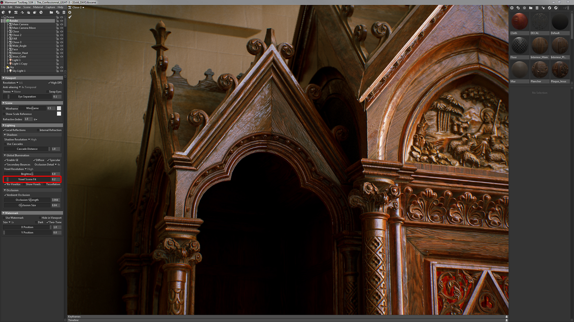
Lower values will result in more Voxel Resolution up close, leading to better occlusion. The drawback is that it’s missing the background, meaning that the reflection will not reflect the surrounding environment.

Higher values will result in having much less Voxel Resolution up close, but will lead to more realistic diffused and reflected light. This is due to the voxel covering the whole scene and taking the surroundings into account. The drawback here is that it tends to wash out the occluded area, even in low light.

In some cases, I combined the two shots to get the best of both worlds. You can find more information about the Global Illumination settings in Episode 5 of Getting to Know Toolbag 3.
Fog
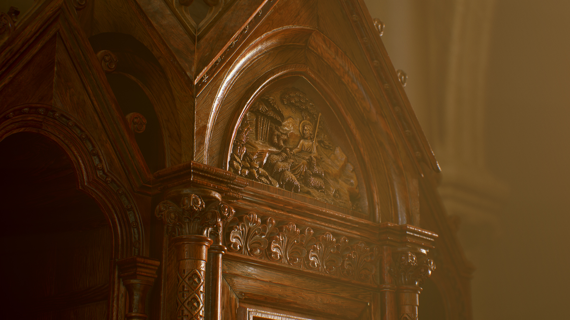
The second most important aspect of the mood is the volumetric lighting, which is achieved with Fog. Old churches are heavily atmospheric. Humidity and dust particles in the air create an almost “touchable” light, mostly seen early in the morning and late evening.
The setup for volumetric light is simple. First, add a direct, shadow casting Light object. Then, add a Fog object. To emphasize the volume of the light, you’ll have to reduce the Ambient / Sky Illumination. You’ll need to find a good balance for each scene, because increasing the Ambient / Sky and Light sliders can make everything look crunchy. Watch the video for a better understanding.
Post Processing

For the final look, I wanted to mimic a vintage lens. So things like Chromatic Aberration and Barrel Distortion came in handy. It is important not to overdo it. I added a polaroid frame and an old film grain in Photoshop.
These are my values for Distortion in the Camera settings:
- Barrel/Pincushion: 0.02
- Chromatic Aberration: 0.055
Then I used the Filmic (Hejl) Tone Mapping curve with an Exposure of 2.2. I’ve also shared the Curve Presets I created for this project.

And last but not least, let’s not forget about the Depth of Field. You can’t go wrong with the pretty bokeh effect, and it helps create a focal point for the viewer. Yeah, I admit it helped hiding the crap background too 😀
To wrap this article, here’s a video showing off the final scene with closeups.
A big thank you to the Marmoset team for considering me to write this breakdown article. And thanks to everyone who read this and reached the final line!
You can find more of Walid’s work on Artstation.
Learn how to achieve realistic renders with Toolbag 3.